pictslider
Description
A slider control that uses pictures in external files for its appearance. It uses two pictures--one for the "knob" and one for the background over which the knob moves. The pictslider object has default pictures that are used if you do not want to supply pictures of your own, but its intended use is creating controls with customized appearances.
Examples
Discussion
You can use the pictslider object to create horizontal or vertical sliders, as well as two-dimensional controllers (virtual trackpads or joysticks).
Note: The pictslider object customarily uses images saved in Portable Network Graphics (.png) format. If you are using Max on Windows, we recommend that you install QuickTime and choose a complete install of all optional components to work with images other than PNG or PICT files.
Arguments
None.
Attributes
active [int] (default: 1)
Toggles mouse control of the pictslider object. The default is 1 (enabled). If a separate set of inactive images is present in the pictslider object's graphics file and if the inactive images attribute is set, the active message will also change the appearance of the control.
bgcolor [4 floats]7.0.0
Sets the background color of the pictslider object in RGBA format.
bkgnddrag [int] (default: 0)
Toggles background drag mode for the pictslider object. When this mode is enabled, clicking and dragging anywhere in the background area of the slider will move the knob; the knob will move relative to the motion of the mouse, just as if you had clicked in the knob itself. The message disables this mode. You must also uncheck the KnobJumps to Click Location checkbox in the pictslider object's Inspector or send the object a message to enable this mode.
bkgndpict [symbol] (default: <default>)
Designates the graphics file that the pictslider object will use for the control's background image. The symbol used as a filename must either be the name of a file in Max's current search path, or an absolute pathname for the file (e.g. "").
bkgndsize [int] (default: 0)
Sets the pictslider object to change the size of the object to match the size of the background picture. After receiving this message, the object's size cannot be changed. allows the control to be resized in the usual manner by dragging its lower-right corner.
bottommargin [int] (default: 0)
Sets the bottom margin, in pixels, for the pictslider. The margin reduces the area in which the knob moves; if a margin is zero, the knob can move all the way to the bottom of the slider.
bottomvalue [atom_long] (default: 0)
Sets the values emitted by the pictslider object when the knob is moved as far as possible to the bottom. The message will cause the control to send 100 out of its left outlet when the knob is moved all the way to the bottom.
clickedimage [int] (default: 1)
Specifies that the graphics file used by the pictslider object contains an additional image to be displayed when the control is clicked.
color [4 floats]7.0.0
Sets the knob color of the pictslider object in RGBA format.
elementcolor [4 floats]7.0.0
Sets the knob color of the pictslider object when it is dragged in RGBA format.
horizontaltracking [float] (default: 1.)
Sets the horizontal tracking ratio for movements of the pictslider object's knob. The default value is 1.0. Values greater than one cause the knob to move more quickly when dragged; values less than one cause it to move more slowly.
imagemask [int] (default: 0)
When set to 1, specifies that the graphics file used by the pictslider object contains image masks. This attribute is present for legacy support - it has been superseded by the use of alpha channels in images.
inactiveimage [int] (default: 1)
When set to non-zero, specifies that the graphics file used by the pictslider object contains additional images for the object's inactive state.
invisiblebkgnd [int] (default: 0)
When set to non-zero, the pictslider object will not draw any background image. The knob will appear to float above any objects underneath it.
jump [int] (default: 1)
When set to non-zero, makes pictslider move the knob to the position of the cursor if you click in the object outside of the knob. disables this behavior; you must click in the knob itself to move it.
knobpict [symbol] (default: <default>)
Designates the graphics file that the pictslider object will use for the control's knob image. By convention, the pictslider object uses images saved in Portable Network Graphics (.png) format. If you are using Max on Windows and want to to work with images other than PNG or PICT files, we recommend that you install QuickTime and choose a complete install of all optional components. The symbol used as a filename must either be the name of a file in Max's current search path, or an absolute pathname for the file (e.g. "").
leftmargin [int] (default: 0)
Sets the left margin, in pixels, for the pictslider. The margin reduces the area in which the knob moves; if a margin is zero, the knob can move all the way to the left of the slider.
leftvalue [atom_long] (default: 0)
Sets the values emitted by the pictslider object when the knob is moved as far as possible to the left. The message will cause the control to send 100 out of its left outlet when the knob is moved all the way to the left.
movehorizontal [int] (default: 1)
When set to non-zero, allows the knob to change when the mouse is moved horizontally. The message prevents the knob from moving when the mouse is moved horizontally.
movevertical [int] (default: 1)
When set to non-zero, allows the knob to change when the mouse is moved vertically. The message prevents the knob from moving when the mouse is moved vertically.
parameter_enable [int]
Enables use of this object with Max for Live Parameters and allows for setting initial parameter values in the Max environment.
parameter_mappable [int] (default: 1)
When parameter_mappable is enabled, the object will be available for mapping to keyboard or MIDI input using the Mappings feature. (default = 1).
rightmargin [int] (default: 0)
Sets the right margin, in pixels, for the pictslider. The margin reduces the area in which the knob moves; if a margin is zero, the knob can move all the way to the right of the slider.
rightvalue [atom_long] (default: 127)
Sets the values emitted by the pictslider object when the knob is moved as far as possible to the right. The message will cause the control to send 100 out of its left outlet when the knob is moved all the way to the right.
scaleknob [int] (default: 0)
When set to non-zero, tells the pictslider object to stretch or shrink the knob when you change the size of the entire object. will result in the knob always being drawn at its original size.
style [symbol] (default: )7.0.0
Sets the style to be applied to the object. Styles can be set using the Format palette.
topmargin [int] (default: 0)
Sets the top margin, in pixels, for the pictslider. The margin reduces the area in which the knob moves; if a margin is zero, the knob can move all the way to the top of the slider.
topvalue [atom_long] (default: 127)
Sets the values emitted by the pictslider object when the knob is moved as far as possible to the top. The message will cause the control to send 100 out of its left outlet when the knob is moved all the way to the top.
verticaltracking [float] (default: 1.)
Sets the vertical tracking ratio for movements of the pictslider object's knob. The default value is 1.0. Values greater than one cause the knob to move more quickly when dragged; values less than one cause it to move more slowly.
Common Box Attributes
annotation [symbol]
Sets the text that will be displayed in the Clue window when the user moves the mouse over the object.
background [int] (default: 0)
Adds or removes the object from the patcher's background layer. adds the object to the background layer, removes it. Objects in the background layer are shown behind all objects in the default foreground layer.
color [4 floats]
Sets the color for the object box outline.
fontface [int]
Sets the type style used by the object. The options are:
plain
bold
italic
bold italic
Possible values:
0 = 'regular'
1 = 'bold'
2 = 'italic'
3 = 'bold italic'
fontname [symbol]
Sets the object's font.
fontsize [float]
Sets the object's font size (in points).
Possible values:
'8'
'9'
'10'
'11'
'12'
'13'
'14'
'16'
'18'
'20'
'24'
'30'
'36'
'48'
'64'
'72'
hidden [int] (default: 0)
Toggles whether an object is hidden when the patcher is locked.
hint [symbol]
Sets the text that will be displayed in as a pop-up hint when the user moves the mouse over the object in a locked patcher.
ignoreclick [int] (default: 0)
Toggles whether an object ignores mouse clicks in a locked patcher.
jspainterfile [symbol]
JS Painter File
patching_rect [4 floats] (default: 0. 0. 100. 0.)
Sets the position and size of the object in the patcher window.
position [2 floats]
Sets the object's x and y position in both patching and presentation modes (if the object belongs to its patcher's presentation), leaving its size unchanged.
presentation [int] (default: 0)
Sets whether an object belongs to the patcher's presentation.
presentation_rect [4 floats] (default: 0. 0. 0. 0.)
Sets the x and y position and width and height of the object in the patcher's presentation, leaving its patching position unchanged.
rect [4 floats]
Sets the x and y position and width and height of the object in both patching and presentation modes (if the object belongs to its patcher's presentation).
size [2 floats]
Sets the object's width and height in both patching and presentation modes (if the object belongs to its patcher's presentation), leaving its position unchanged.
textcolor [4 floats]
Sets the color for the object's text in RGBA format.
textjustification [int]
Sets the justification for the object's text.
Possible values:
0 = 'left'
1 = 'center'
2 = 'right'
varname [symbol]
Sets the patcher's scripting name, which can be used to address the object by name in pattr, scripting messages to thispatcher, and the js object.
Parameter Attributes
Order
Sets the order of recall of this parameter. Lower numbers are recalled first. The order of recall of parameters with the same order number is undefined.
Parameter Mode Enable
Parameter Mode Enable (not available from Parameters window)
Link to Scripting Name
When checked, the Scripting Name is linked to the Long Name attribute.
Long Name
The long name of the parameter. This name must be unique per patcher hierarchy.
Short Name
Sets the short name for the object's visual display. The maximum length varies according to letter width, but is generally in a range of 5 to 7 characters.
Type
Specifies the data type. The data types used in Max for Live are:
Float
Int
Enum (enumerated list)
Blob
Note: By convention, the Live application uses floating point numbers
for its calculations; the native integer representation is limited to 256
values, with a default range of 0-255 (similar to the char data type used
in Jitter). When working with Live UI objects whose integer values will
exceed this range, the Type attribute should be set to Float,
and the Unit Style attribute should be set to Int.
Range/Enum
When used with an integer or floating point data type, this field is
used to specify the minimum and maximum values of the parameter.
When used with an enumerated list (Enum) data type, this field contains
a space-delimited list of the enumerated values (if list items contain a
space or special characters, the name should be enclosed in double
quotes).
Clip Modulation Mode
Sets the Clip Modulation Mode used by the Live application. The modulation
modes are:
None
Unipolar
Bipolar
Additive
Absolute
Clip Modulation Range
This parameter is only used with the Absolute modulation mode. It specifies defines the range of values used.
Initial Enable
When checked (set to 1), the UI object can store an initialization value. The value is set using the Initial attribute (see below).
Initial
Sets the initial value to be stored and used when the Initial Enable attribute is checked.
Unit Style
Sets the unit style to be used when displaying values. The unit style
values are: Int: displays integer values
Float: displays floating point values
Time: displays time values in milliseconds (ms)
Hertz: displays frequency values (Hz/kHz).
deciBel: displays loudness (dB)
%: Percentage
Pan: displays Left and Right values
Semitones: displays steps (st)
MIDI: displays pitch corresponding to the MIDI note number
Custom: displays custom data type
Native: defaults to floating point values
Custom Units
Sets the units to be used with the 'Custom' unit style (see "Unit Style", above). Custom unit strings may be simple symbols (e.g. "Harmonic(s)"), in which case the parameter's value will be displayed in its 'Native' display mode, followed by the symbol (e.g. "12 Harmonic(s)" for an Int-typed parameter or "12.54 Harmonic(s)" for a Float-typed parameter). For additional control over the numerical component displayed, a sprintf-style string may be used (e.g. "%0.2f Bogon(s)", which would display a value such as ".87 Bogons").
Exponent
When set to a value other than 1., the parameter's input and output values will be exponentially scaled according to the factor entered in this column.
Steps
The number of steps available between the minimum and maximum values of a parameter. For instance, if the parameter has a range from 0.-64., with Steps set to 4, the user can only set the parameter to 0, 21.33, 42.66 and 64.
Parameter Visibility
For automatable parameters (Int, Float, Enum), 'Stored Only' disables automation, although parameter values are stored in presets. 'Hidden' causes the parameter's value to be ignored when storing and recalling data. Non-automatable parameters (Blob) are 'Stored Only' by default, and can be set to 'Hidden', if desired.
Update Limit (ms)
Speed limits values triggered by automation.
Defer Automation Output
Defers values triggered by automation.
Messages
bang
int
Arguments
In right inlet: sets the pictslider object's vertical value. The value is also sent out the right outlet, and the control's current horizontal value is sent out the left outlet.
float
Arguments
list
Arguments
vertical [int]
(drag)
bkgndpicture
Arguments
knobpicture
Arguments
(mouse)
readanybkgnd
Arguments
readanyknob
Arguments
set
Arguments
vertical [int]
In right inlet: The word , followed by a number, sets the pictslider object's vertical value, but does not send the value out its right outlet.
track
Arguments
In right inlet: The word , followed by a float, sets the tracking ratio for vertical movements of the pictslider object's knob.
Picture File Format
Specifications
The pictslider object uses the two picture files: one for the background, and one for the knob that is moved over the background with the mouse.
Background picture files can be in PICT format, or if QuickTime Version 3.0 or later is installed, one of the other graphics file formats listed in Jitter Appendix A. Background picture files must have the following layout:
Only one image is required; if only one image is supplied, it will be used for drawing all states of the background. Additional images are placed to the right of the first image. You can add images for the inactive state of the control. The inactive image will be used after the control has received an message.
Knob files must be in PICT format with the following layout:
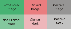
The picture is made up of a grid of one or more images. All images have the same width and height.
Only one image is required; if only one image is supplied, it will be used for drawing all states of the knob. Additional images are placed to the right of the first image. You can add images for either or both the "clicked" or inactive states of the control. The "clicked" image will be shown when the user is dragging the control's knob. The inactive image will be used after the control has received an message.
Image masks can be used to create knobs with non-rectangular outlines. These masks are directly below their corresponding images in the picture file. If you wish to use masks for any of the knob images, you must provide masks for all of them--each image will have a corresponding row of masks. Black pixels in the mask image create areas of the corresponding image that will be drawn, and white pixels create invisible areas.
Output
int
Moving the slider's knob by clicking and dragging it with the mouse, or sending values to either of its inlets, causes its horizontal value to be emitted from the left outlet and its vertical value to be emitted from the right outlet. Incoming values are constrained to the ranges determined by the top/bottom and left/right values set in the inspector.
See Also
| Name | Description |
|---|---|
| dial | Output numbers using an onscreen dial |
| kslider | Output numbers from an onscreen keyboard |
| multislider | Display data as sliders or a scrolling display |
| nslider | Output numbers from a notation display |
| pictctrl | Picture-based control |
| rslider | Display or change a range of numbers |
| slider | Move a slider to output values |
| tab | Tab control |
| textbutton | Button with text |
| ubutton | Transparent button |
| Max Basic Tutorial 14: Encapsulation | Max Basic Tutorial 14: Encapsulation |
| Max Interface Tutorial 2: Picture UI Elements | Max Interface Tutorial 2: Picture UI Elements |