radiogroup
Description
Provides a user interface for option selection. There are two modes of operation: radio button and checkbox.
Examples
Discussion
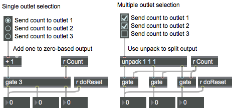
The radiogroup object has two modes of operation: radio button and check box. In radio button mode, the radiogroup object provides a user-definable number of buttons in a group, only one of which may be selected at a time. In check box mode, the indicators in the radiogroup object function as a set of on/off indicators. Check box mode also supports a way to have the checkboxes act as indicators for the bit pattern of a binary representation of an integer (see the message).
Note: radiogroup can be re-sized horizontally so it will extend under comment boxes placed to the right of the buttons or boxes. this way, clicking on the text to the right of the button will also set the button selection or box state.
Arguments
None.
Attributes
activecolor [4 floats]
Sets the color for the active radiobuttons/checkboxes in RGBA format.
bgcolor [4 floats]
Sets the background color for the object in RGBA format.
elementcolor [4 floats]
Sets the off color for the radiobuttons/checkboxes in RGBA format. This color only applies if the shape attribute is set to Square (1) or Circle (2).
enabled [atom]
Enables/disables buttons. The word , followed by followed by a list of zeroes and ones whose length is the same as the number of buttons or boxes, will disable (0) or enable (1) the item in the list position that corresponds to the button or box (e.g., will disable only the fourth button or box).
flagmode [int] (default: 0)
Sets the flag mode of operation for the radiogroup object. In this mode, each check box corresponds to one bit in an integer value (i.e., the first radio button or checkbox corresponds to the ones bit, the second button or checkbox to the twos bit, the third button or checkbox to the fours bit, etc.). The message disables this mode (default).
inactive [int] (default: 0)
Toggles the active or inactive state of the entire group of radio buttons or check boxes.
itemtype [atom_long] (default: 0)
Selects the mode of operation for the radiogroup object.
(the default)
Possible values:
0 = 'Radio Buttons'
1 = 'Check Boxes'
offset [int] (default: 16)
Sets the pixel offset (spacing) between the tops of the buttons/boxes. the minimum offset is 14 pixels, the default offset is 16 pixels.
parameter_enable [int]
Enables use of this object with Max for Live Parameters and allows for setting initial parameter values in the Max environment.
parameter_mappable [int] (default: 1)
When parameter_mappable is enabled, the object will be available for mapping to keyboard or MIDI input using the Max Mappings feature.
selection [atom]
Specifies the currently selected button or box.
shape [int] (default: 0)7.0.0
Sets the shape of the radiobuttons/checkboxes.
Possible values:
0 = 'Classic'
1 = 'Square'
2 = 'Circle'
size [atom_long] (default: 2)
Specifies the number of buttons or boxes. The default is 2, and the maximum is 64. Note: If you care using the radiogroup object in check box mode and have enabled Flag Mode, you will only be able to set 32 checkboxes.
style [symbol] (default: )7.0.0
Sets the style to be applied to the object. Styles can be set using the Format palette.
Common Box Attributes
annotation [symbol]
Sets the text that will be displayed in the Clue window when the user moves the mouse over the object.
background [int] (default: 0)
Adds or removes the object from the patcher's background layer. adds the object to the background layer, removes it. Objects in the background layer are shown behind all objects in the default foreground layer.
color [4 floats]
Sets the color for the object box outline.
fontface [int]
Sets the type style used by the object. The options are:
plain
bold
italic
bold italic
Possible values:
0 = 'regular'
1 = 'bold'
2 = 'italic'
3 = 'bold italic'
fontname [symbol]
Sets the object's font.
fontsize [float]
Sets the object's font size (in points).
Possible values:
'8'
'9'
'10'
'11'
'12'
'13'
'14'
'16'
'18'
'20'
'24'
'30'
'36'
'48'
'64'
'72'
hidden [int] (default: 0)
Toggles whether an object is hidden when the patcher is locked.
hint [symbol]
Sets the text that will be displayed in as a pop-up hint when the user moves the mouse over the object in a locked patcher.
ignoreclick [int] (default: 0)
Toggles whether an object ignores mouse clicks in a locked patcher.
jspainterfile [symbol]
JS Painter File
patching_rect [4 floats] (default: 0. 0. 100. 0.)
Sets the position and size of the object in the patcher window.
position [2 floats]
Sets the object's x and y position in both patching and presentation modes (if the object belongs to its patcher's presentation), leaving its size unchanged.
presentation [int] (default: 0)
Sets whether an object belongs to the patcher's presentation.
presentation_rect [4 floats] (default: 0. 0. 0. 0.)
Sets the x and y position and width and height of the object in the patcher's presentation, leaving its patching position unchanged.
rect [4 floats]
Sets the x and y position and width and height of the object in both patching and presentation modes (if the object belongs to its patcher's presentation).
size [2 floats]
Sets the object's width and height in both patching and presentation modes (if the object belongs to its patcher's presentation), leaving its position unchanged.
textcolor [4 floats]
Sets the color for the object's text in RGBA format.
textjustification [int]
Sets the justification for the object's text.
Possible values:
0 = 'left'
1 = 'center'
2 = 'right'
varname [symbol]
Sets the patcher's scripting name, which can be used to address the object by name in pattr, scripting messages to thispatcher, and the js object.
Parameter Attributes
Order
Sets the order of recall of this parameter. Lower numbers are recalled first. The order of recall of parameters with the same order number is undefined.
Parameter Mode Enable
Parameter Mode Enable (not available from Parameters window)
Link to Scripting Name
When checked, the Scripting Name is linked to the Long Name attribute.
Long Name
The long name of the parameter. This name must be unique per patcher hierarchy.
Short Name
Sets the short name for the object's visual display. The maximum length varies according to letter width, but is generally in a range of 5 to 7 characters.
Type
Specifies the data type. The data types used in Max for Live are:
Float
Int
Enum (enumerated list)
Blob
Note: By convention, the Live application uses floating point numbers
for its calculations; the native integer representation is limited to 256
values, with a default range of 0-255 (similar to the char data type used
in Jitter). When working with Live UI objects whose integer values will
exceed this range, the Type attribute should be set to Float,
and the Unit Style attribute should be set to Int.
Range/Enum
When used with an integer or floating point data type, this field is
used to specify the minimum and maximum values of the parameter.
When used with an enumerated list (Enum) data type, this field contains
a space-delimited list of the enumerated values (if list items contain a
space or special characters, the name should be enclosed in double
quotes).
Clip Modulation Mode
Sets the Clip Modulation Mode used by the Live application. The modulation
modes are:
None
Unipolar
Bipolar
Additive
Absolute
Clip Modulation Range
This parameter is only used with the Absolute modulation mode. It specifies defines the range of values used.
Initial Enable
When checked (set to 1), the UI object can store an initialization value. The value is set using the Initial attribute (see below).
Initial
Sets the initial value to be stored and used when the Initial Enable attribute is checked.
Unit Style
Sets the unit style to be used when displaying values. The unit style
values are: Int: displays integer values
Float: displays floating point values
Time: displays time values in milliseconds (ms)
Hertz: displays frequency values (Hz/kHz).
deciBel: displays loudness (dB)
%: Percentage
Pan: displays Left and Right values
Semitones: displays steps (st)
MIDI: displays pitch corresponding to the MIDI note number
Custom: displays custom data type
Native: defaults to floating point values
Custom Units
Sets the units to be used with the 'Custom' unit style (see "Unit Style", above). Custom unit strings may be simple symbols (e.g. "Harmonic(s)"), in which case the parameter's value will be displayed in its 'Native' display mode, followed by the symbol (e.g. "12 Harmonic(s)" for an Int-typed parameter or "12.54 Harmonic(s)" for a Float-typed parameter). For additional control over the numerical component displayed, a sprintf-style string may be used (e.g. "%0.2f Bogon(s)", which would display a value such as ".87 Bogons").
Exponent
When set to a value other than 1., the parameter's input and output values will be exponentially scaled according to the factor entered in this column.
Steps
The number of steps available between the minimum and maximum values of a parameter. For instance, if the parameter has a range from 0.-64., with Steps set to 4, the user can only set the parameter to 0, 21.33, 42.66 and 64.
Parameter Visibility
For automatable parameters (Int, Float, Enum), 'Stored Only' disables automation, although parameter values are stored in presets. 'Hidden' causes the parameter's value to be ignored when storing and recalling data. Non-automatable parameters (Blob) are 'Stored Only' by default, and can be set to 'Hidden', if desired.
Update Limit (ms)
Speed limits values triggered by automation.
Defer Automation Output
Defers values triggered by automation.
Messages
bang
In check box mode: A outputs a list of zeros and ones representing the on/off state of the check boxes.
In flag mode: A send the integer that corresponds to the bit pattern of the currently checked boxes (i.e., if boxes one, two, and three are checked, a will output a value of )out the radiogroup object's output.
int
Arguments
In flag mode: An integer value received in the radiogroup object's inlet will set the buttons or checkboxes to reflect the bit pattern of the integer value (i.e., a value of 19 will select boxes one, two, and five, corresponding to the binary value ) and send the integer value out the radiogroup object's output.
list
Arguments
disableitem
Arguments
enableitem
Arguments
(mouse)
set
Arguments
In check box mode: The word , followed by a list of zeros and ones, sets the check box states without triggering any output.
If you are using check box mode and are also using Flag Mode, a number will set the state of the first 32 checkboxes in a pattern which corresponds to the bit pattern of the number without triggering output (see the section for more information).
Output
int
In radio button mode: Clicking on a radio button outputs an int corresponding to the radio button selected. Numbering begins with 0.
In flag mode: Clicking on a check box outputs an int corresponding to the bit pattern represented by the checked boxes (i.e., if boxes one, two, and three are checked, a will output a value of ).
list
In check box mode: A will output a list of zeros and one which indicate the on/off state of the group of check boxes.
See Also
| Name | Description |
|---|---|
| button | Blink and send a bang |
| matrixctrl | Matrix switch control |
| pictctrl | Picture-based control |
| toggle | Switch between off and on (0/1) |
| ubutton | Transparent button |
| Max Basic Tutorial 21: Controlling Data Flow | Max Basic Tutorial 21: Controlling Data Flow |