Examples
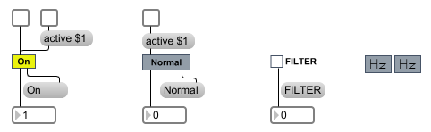
A user interface button/toggle
| bang | A bang message will toggle the state of the object. If it is off, it will switch on and output a 1. If it is on, it will switch off and output a 0. | |
| int | input [int] |
In the mode, any non-zero number will toggle the button to the "on" position, send the button text out the middle outlet and send a 1 out the left outlet. A zero sets the toggle to the "off" position, sends the button text out the middle outlet and sends a 0 out the left outlet. |
| float | input [float] |
Converted to . |
| assign | assign-input [float] |
The word , followed by a floating point value, causes that value to be stored and displayed and sent out the live.text object's outlet. If the Parameter Visibility attribute is set to Stored Only, the message will not add the new value to the Live application’s undo chain. |
| init | Restore and output the initial value. | |
| (mouse) | In mode, a mouse click on live.text highlights it for as long as the mouse is held down, sending the text out the second outlet and a message out the left outlet. In mode, a mouse click behaves the same as a live.toggle. When the mouse is clicked, the live.text object will send a 1 out the left outlet if the cursor is inside of the live.text object's rectangle, and a 0 if it is not. The button text is also sent out the second outlet on mouse click. |
|
| outputvalue | Sends the current value out the outlet. | |
| set | set-input [float] |
In the mode, the messages toggles the "on" or "off" state without sending anything out the outlets. The word , followed by any non-zero number, sets toggle to on. The message sets it to "off". |
| setsymbol | button-text-item [list] |
In the mode, the word , followed by a symbol that specifies a button text item, causes live.text to display that symbol and act as though the object were toggled to that state. |
| symbol | button-text-item [list] |
In the mode, the word , followed by a symbol that specifies a button text item, causes live.text to display that symbol and act as though the object were toggled to that state. |
| rawfloat | input-value [float] |
A raw normalized value (between 0. and 1.) received in the inlet is converted to a real value, and then functions like any other received int value in toggle mode. |
| Name | Type | g/s | Description |
|---|---|---|---|
| active | int def.:1 |
Toggles the object's active mode. When is set to 0, the mouse action does not cause output and the inactive colors are used. | |
| activebgcolor | float | Sets the background color off displayed when the attribute is set to 1. | |
| activebgoncolor | float | Sets the background color on displayed when the attribute is set to 1. | |
| activetextcolor | float | Sets the display color for the live.text object's text in RGBA format. | |
| activetextoncolor | float | Sets the display color for the live.text object's text when it is on. | |
| appearance | int def.:0 |
Defines the display style. The options are: 0: Default. The text appears with the boundaries of the text box. 1: Label. The text box appears as a square button, with the text appearing to the right. |
|
| automation | symbol def.:val1 |
Sets the automation "off" label that will appear in Live. | |
| automationon | symbol def.:val2 |
Sets the automation on label that will appear in Live. | |
| bgcolor | float | Sets the background color "off" displayed when the attribute is set to 0. | |
| bgoncolor | float | Sets the background color on displayed when the attribute is set to 0. | |
| bordercolor | float | Sets the display color for the live.text object's border in RGBA format. | |
| focusbordercolor | float | Sets the display color for the live.text object's border in RGBA format. | |
| mode | int def.:1 |
Sets the button mode. Button modes are: 0: Button mode 1: Toggle (switch) mode |
|
| pictures | symbol def.:<none> <none> |
Sets the paths for pictures used when the attribute is set to 1. Bitmap images such as PNG or vectorized images (SVG) can be used. | |
| text | symbol def.:A |
Sets the button label when the button is in the off state. | |
| textcolor | float | Sets the display color for the live.text object's text when the attribute is set to 0. | |
| texton | symbol def.:B |
Sets the button label when the button is in the "on" state. | |
| transition | int def.:0 |
The parameter automation of live.text stores 0 and 1 values. The attribute specifies when a will be sent to the outlet. : output a when the parameter value changes from 0. to 1. : output a when the parameter value changes from 1. to 0. : output a when the parameter value changes from 0. to 1. and when it changes from 1. to 0. |
|
| usepicture | int def.:0 |
Toggles the use of pictures instead of text for display. Note that you need to provide enough pictures by setting the attribute properly. |
| Name | Description |
|---|---|
| live.button | Flash on any message, send a bang |
| live.tab | A user interface tab/multiple button object |
| live.toggle | Switch between off and on (0 and 1) |
| textbutton | A user interface button/toggle |