pictctrl
Description
Creating buttons, switches, knobs, and other controls using images from a picture file for its appearance.
Examples
Discussion
Note: The pictctrl object object customarily uses images saved in Portable Network Graphics (.png) format. If you are using Max on Windows, we recommend that you install QuickTime and choose a complete install of all optional components to work with images other than PNG or PICT files.
Arguments
None.
Attributes
active [int] (default: 1)
Toggles mouse control of the pictctrl object. The default is 1 (enabled). If a separate set of inactive images is present in the pictctrl object's picture file and if the inactive images attribute is set, the message will also change the appearance of the control.
clickedimage [int] (default: 0)
Toggles the use of an alternate set of image frames in your picture file to give the dial a different appearance when the user clicks on it and drags the mouse pointer. disables this feature.
clickincrement [int] (default: 0)
Sets the output value to increment by 1 each time the object is clicked (Click to Increment mode). Any movement of the mouse after clicking is ignored. When the uppermost value is reached, the value returns to zero with the next click. All other mouse tracking modes are disabled. disables Click to Increment mode.
clip [int] (default: 1)
Causes pictctrl, while in dial-mode, to clip mouse-movement within the range of the dial. When followed by a 0, pictctrl will wrap around to the minimum when it surpasses the maximum value (within the range of the dial) and vice versa to the maximum when it surpasses the minimum value.
degrees [int] (default: 270)
Specifies the degree-of-rotation pictctrl has while in dial-mode.
frames [int] (default: 10)
Specifies the number of images (columns) in the picture file. The number of frames does not have to be the same as the range of the control; the pictctrl object will use the nearest image for any given value.
imagemask [int] (default: 0)
When non-zero, indicates that your picture file has an image mask. The default is 0 (no image mask). This attribute is present for legacy support - it has been superseded by the use of alpha channels in images.
inactiveimage [int] (default: 0)
When non-zero, indicates that your picture file has an additional row of images for its inactive state. The default is 0 (no inactive state).
mode [int] (default: 0)
Selects mode of operation for the pictctrl object.
(the default)
Possible values:
0 = 'Button'
1 = 'Toggle'
2 = 'Dial'
multiplier [int] (default: 0)
Sets a multiplier value. When pictctrl is in dial mode, the object's value is multiplied by this number before being sent out the outlet. The multiplication happens before the addition of the Offset value. The default multiplier value is 1.
name [symbol] (default: <default>)
Designates the graphics file that the pictctrl object will use will use for the control's button or dial file. By convention, the pictslider object uses images saved in Portable Network Graphics (.png) format. If you are using Max on Windows and want to to work with images other than PNG or PICT files, we recommend that you install QuickTime and choose a complete install of all optional components. The symbol used as a filename must either be the name of a file in Max's current search path, or an absolute pathname for the file (e.g. "").
offset [atom_long] (default: 0)
Sets an offset value. When pictctrl is in dial mode, the offset value is added to the object's value before being sent out the outlet. The default offset value is 0.
parameter_enable [int]
Enables use of this object with Max for Live Parameters and allows for setting initial parameter values in the Max environment.
parameter_mappable [int] (default: 1)
When parameter_mappable is enabled, the object will be available for mapping to keyboard or MIDI input using the Mappings feature.
range [int] (default: 128)
Sets the range of the pictctrl object when it is in dial mode. The default value is 128.
ratio [int] (default: 2)
Specifies how many pixels the mouse pointer must move before the value of the dial changes by one increment. If the pictctrl object is using Circular Tracking, the ratio message specifies how many degrees the cursor must move, relative to the center of the object, to increase the value by one.
snap [int] (default: 0)
Sets pictctrl to snap to the image's original size. When followed by a 0, pictctrl will not snap to the image's original size.
threshold [float] (default: 0.)
Sets the button Alpha hit threshold.
trackcircular [int] (default: 0)
Sets the pictctrl object to respond when you click on it and drag the mouse in a circular arc relative to the control's center (Circular Tracking mode). Moving the mouse clockwise increases the control's value, and moving it counterclockwise decreases its value. Enabling circular tracking disables all other tracking modes. disables circular tracking.
trackhorizontal [int] (default: 0)
Sets the pictctrl object to respond when you click on it and drag the mouse horizontally; moving the mouse to the right increases the object's value, and moving it to the left decreases the value. Enabling this mode of operation disables the Circular Tracking and Click to Increment modes (see the and messages).
tracking [int] (default: 0)
Toggles live tracking. If live tracking is on, the pictctrl object will change its state if the mouse moves in and out of the rectangular border of the object with the mouse button held down. disables live tracking
trackvertical [int] (default: 0)
Sets the pictctrl object to respond when you click on it and drag the mouse vertically; moving the mouse up increases the object's value, and moving it down decreases the value. Enabling this mode of operation disables the Circular Tracking and Click to Increment modes (see the and messages).
Common Box Attributes
annotation [symbol]
Sets the text that will be displayed in the Clue window when the user moves the mouse over the object.
background [int] (default: 0)
Adds or removes the object from the patcher's background layer. adds the object to the background layer, removes it. Objects in the background layer are shown behind all objects in the default foreground layer.
color [4 floats]
Sets the color for the object box outline.
fontface [int]
Sets the type style used by the object. The options are:
plain
bold
italic
bold italic
Possible values:
0 = 'regular'
1 = 'bold'
2 = 'italic'
3 = 'bold italic'
fontname [symbol]
Sets the object's font.
fontsize [float]
Sets the object's font size (in points).
Possible values:
'8'
'9'
'10'
'11'
'12'
'13'
'14'
'16'
'18'
'20'
'24'
'30'
'36'
'48'
'64'
'72'
hidden [int] (default: 0)
Toggles whether an object is hidden when the patcher is locked.
hint [symbol]
Sets the text that will be displayed in as a pop-up hint when the user moves the mouse over the object in a locked patcher.
ignoreclick [int] (default: 0)
Toggles whether an object ignores mouse clicks in a locked patcher.
jspainterfile [symbol]
JS Painter File
patching_rect [4 floats] (default: 0. 0. 100. 0.)
Sets the position and size of the object in the patcher window.
position [2 floats]
Sets the object's x and y position in both patching and presentation modes (if the object belongs to its patcher's presentation), leaving its size unchanged.
presentation [int] (default: 0)
Sets whether an object belongs to the patcher's presentation.
presentation_rect [4 floats] (default: 0. 0. 0. 0.)
Sets the x and y position and width and height of the object in the patcher's presentation, leaving its patching position unchanged.
rect [4 floats]
Sets the x and y position and width and height of the object in both patching and presentation modes (if the object belongs to its patcher's presentation).
size [2 floats]
Sets the object's width and height in both patching and presentation modes (if the object belongs to its patcher's presentation), leaving its position unchanged.
textcolor [4 floats]
Sets the color for the object's text in RGBA format.
textjustification [int]
Sets the justification for the object's text.
Possible values:
0 = 'left'
1 = 'center'
2 = 'right'
varname [symbol]
Sets the patcher's scripting name, which can be used to address the object by name in pattr, scripting messages to thispatcher, and the js object.
Parameter Attributes
Order
Sets the order of recall of this parameter. Lower numbers are recalled first. The order of recall of parameters with the same order number is undefined.
Parameter Mode Enable
Parameter Mode Enable (not available from Parameters window)
Link to Scripting Name
When checked, the Scripting Name is linked to the Long Name attribute.
Long Name
The long name of the parameter. This name must be unique per patcher hierarchy.
Short Name
Sets the short name for the object's visual display. The maximum length varies according to letter width, but is generally in a range of 5 to 7 characters.
Type
Specifies the data type. The data types used in Max for Live are:
Float
Int
Enum (enumerated list)
Blob
Note: By convention, the Live application uses floating point numbers
for its calculations; the native integer representation is limited to 256
values, with a default range of 0-255 (similar to the char data type used
in Jitter). When working with Live UI objects whose integer values will
exceed this range, the Type attribute should be set to Float,
and the Unit Style attribute should be set to Int.
Range/Enum
When used with an integer or floating point data type, this field is
used to specify the minimum and maximum values of the parameter.
When used with an enumerated list (Enum) data type, this field contains
a space-delimited list of the enumerated values (if list items contain a
space or special characters, the name should be enclosed in double
quotes).
Clip Modulation Mode
Sets the Clip Modulation Mode used by the Live application. The modulation
modes are:
None
Unipolar
Bipolar
Additive
Absolute
Clip Modulation Range
This parameter is only used with the Absolute modulation mode. It specifies defines the range of values used.
Initial Enable
When checked (set to 1), the UI object can store an initialization value. The value is set using the Initial attribute (see below).
Initial
Sets the initial value to be stored and used when the Initial Enable attribute is checked.
Unit Style
Sets the unit style to be used when displaying values. The unit style
values are: Int: displays integer values
Float: displays floating point values
Time: displays time values in milliseconds (ms)
Hertz: displays frequency values (Hz/kHz).
deciBel: displays loudness (dB)
%: Percentage
Pan: displays Left and Right values
Semitones: displays steps (st)
MIDI: displays pitch corresponding to the MIDI note number
Custom: displays custom data type
Native: defaults to floating point values
Custom Units
Sets the units to be used with the 'Custom' unit style (see "Unit Style", above). Custom unit strings may be simple symbols (e.g. "Harmonic(s)"), in which case the parameter's value will be displayed in its 'Native' display mode, followed by the symbol (e.g. "12 Harmonic(s)" for an Int-typed parameter or "12.54 Harmonic(s)" for a Float-typed parameter). For additional control over the numerical component displayed, a sprintf-style string may be used (e.g. "%0.2f Bogon(s)", which would display a value such as ".87 Bogons").
Exponent
When set to a value other than 1., the parameter's input and output values will be exponentially scaled according to the factor entered in this column.
Steps
The number of steps available between the minimum and maximum values of a parameter. For instance, if the parameter has a range from 0.-64., with Steps set to 4, the user can only set the parameter to 0, 21.33, 42.66 and 64.
Parameter Visibility
For automatable parameters (Int, Float, Enum), 'Stored Only' disables automation, although parameter values are stored in presets. 'Hidden' causes the parameter's value to be ignored when storing and recalling data. Non-automatable parameters (Blob) are 'Stored Only' by default, and can be set to 'Hidden', if desired.
Update Limit (ms)
Speed limits values triggered by automation.
Defer Automation Output
Defers values triggered by automation.
Messages
bang
int
Arguments
float
Arguments
(drag)
link
Arguments
(mouse)
picture
Arguments
read
Arguments
readany
Arguments
set
Arguments
Picture File Format
Specifications
When you create a new pictctrl object in a patcher window, it has no associated picture file. Use the Open button in the Inspector to choose a picture file for the control. By convention, the pictctrl object uses images saved in Portable Network Graphics (.png) format. If you are using Max on Windows and want to to work with images other than PNG or PICT files, we recommend that you install QuickTime and choose a complete install of all optional components. The layout of the picture in the file varies depending on which mode of operation the pictctrl uses. All three modes require that the pictures be made up of a grid of images, in which all images have the same width and height.
Button mode has the simplest layout:
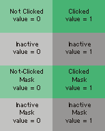
The first row of images is mandatory: these two images are used for the idle and clicked states (values zero and one, respectively) of the button. The next row of images, if present, is used for the control when it is in its inactive state. The next rows contain the masks for the top row of images, and the inactive images if present.
Toggle mode has a similar layout:
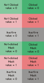
In this mode, the top two rows are mandatory. The first row of images are used when the control's value is zero, the next row when its value is one. The third row is optional; it is used for the control when it is in its inactive state. (Note that there are no "clicked" images for the inactive state, since when inactive, the control ignores mouse clicks.) The next rows contain masks for the images.
The Dial mode layout varies in size depending on how many image frames it has, which must be the same as the Image Frames parameter as set in the inspector:
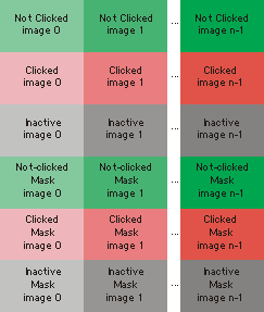
The first row of images is mandatory: one image for each visually distinct state of the control. Dials need as many picts as you wish them to have visible states. Note that dials can receive and send a larger range of values than are represented by picts (e.g. your dial can have a range of 128 even if you only use eight pict frames to represent the range of the dial). The next row of images is optional, and is used when the user is clicking and dragging on the object to change its value. The next row is also optional; (Note that there are no "clicked" images for the inactive state, since when inactive, the control ignores mouse clicks.) The following rows contain masks for the images.
Output
int
The current value of the pictctrl object. In toggle and button modes this will be a 0 or a 1. In dial mode, this value is specified by the range, offset, and multiplier that you set in the Inspector window.
See Also
| Name | Description |
|---|---|
| dial | Output numbers using an onscreen dial |
| kslider | Output numbers from an onscreen keyboard |
| matrixctrl | Matrix switch control |
| pictslider | Picture-based slider control |
| rslider | Display or change a range of numbers |
| slider | Move a slider to output values |
| tab | Tab control |
| textbutton | Button with text |
| ubutton | Transparent button |
| Max Interface Tutorial 2: Picture UI Elements | Max Interface Tutorial 2: Picture UI Elements |