Examples
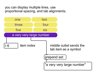
The tab object can be used to create multiple column button/toggle displays and interfaces
A user interface tab/multiple button object
| bang | A message will retrigger the object's output. | |
| int | tab item [int] |
The number specifies a tab item to be sent out, and causes tab to display that item and send the index out the first outlet and the tab text out the second outlet. The items are numbered starting at 0. A tab can also be chosen with the mouse. |
| float | tab item [float] |
Converted to . |
| (mouse) | Clicking on a tab button will highlight and set the selection and send the index out the first outlet and the tab text out the second outlet. | |
| next | Selects the next index to the tab object and causes tab to display that item and send the new index out the first outlet and the tab text out the second outlet. If the last index is currently displayed, it wraps around to the first index. | |
| prev | Selects the previous index to the tab object and causes tab to display that item and send the new index out the first outlet and the tab text out the second outlet. If the first index is currently displayed, it wraps around to the last index. | |
| set | display-item [list] |
The word , followed by a number, specifies a tab item to be sent out, and causes tab to display that item, but does not cause any output. |
| setsymbol | tab name [list] |
The word , followed by a symbol that specifies a tab item, causes tab to display that item, but does not cause any output. |
| symbol | tab name [list] |
The word , followed by a symbol that specifies a tab item, causes tab to display that item and send the index out the first outlet and the tab text out the second outlet. |
| Name | Type | g/s | Description |
|---|---|---|---|
| activesafe | int def.:1 |
When set to one, protects the currently active tab from text truncation. | |
| border | int def.:0 |
Sets the thickness, in pixels, of the object's border. | |
| bordercolor | float | Sets the border color in RGBA format. | |
| borderoncolor | float | Sets the border color when a tab is clicked on in RGBA format. | |
| button | int def.:0 |
Toggles button mode for the tab object. | |
| clicktabcolor | float | Sets the color when a tab is clicked on in RGBA format. | |
| clicktextcolor | float | Sets the text color when a tab is clicked on in RGBA format. | |
| hovertabcolor | float | Sets the tab color displayed on mouseover in RGBA format. | |
| hovertextcolor | float | Sets the text color displayed on mouseover in RGBA format. | |
| htabcolor | float | Sets the tab color for selected items in RGBA format. | |
| htextcolor | float | Sets the text color for selected tab items in RGBA format. | |
| margin | int def.:4 |
Sets the text margin, in pixels, for tab text. | |
| mode | int def.:0 |
Sets the text tab layout mode. The modes are: 0 separate tab entries are equally spaced. This is the default. 1 separate tab entries are proportionally spaced according to the text. Note: to add multiple words, use the backslash before a space (e.g. "one\ down") |
|
| multiline | int def.:1 |
Toggles allowing multiple lines of text in a tab. When set, you can resize the object to create multicoloum displays. | |
| rounded | float def.:14. |
Sets the radius, in pixels for the tab object. | |
| spacing_x | float def.:4. |
Sets the horizontal spacing for the tab object in pixels. | |
| spacing_y | float def.:4. |
Sets the vertical spacing for the tab object in pixels. | |
| tabcolor | float | Sets the tab color for unselected items in RGBA format. | |
| tabs | symbol def.:one two three |
Sets the tab text for each tabe in the tab object. | |
| textcolor | float | Sets the text color for the tab object when the tab is unselected in RGBA format. | |
| truncate | int def.:1 |
Sets the text truncation mode. Alignment modes are: 0 no truncation 1 truncate from the right (e.g. abcdef... . This is the default 2 truncate from center (e.g. abcd...wxyz |
|
| valign | int def.:1 |
Sets the vertical alignment mode. The modes are: 0: Top 1: Center 2: Bottom |
| Name | Description |
|---|---|
| Color | Choosing the Color... menu item from the Object menu when the object is selected opens a color picker, permitting adjustment to the appearance of the tab object. |
| Name | Description |
|---|---|
| matrixctrl | Matrix switch control |
| pictctrl | Picture-based control |
| pictslider | Picture-based slider control |
| textbutton | A user interface button/toggle |
| ubutton | Transparent button, sends a bang |