Picture File Format
Specifications:
The pictslider object uses the two picture files: one for the background, and one for the knob that is moved over the background with the mouse.
Background picture files can be in PICT format, or if QuickTime Version 3.0 or later is installed, one of the other graphics file formats listed in the QuickTime appendix. Background picture files must have the following layout:
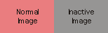
Only one image is required; if only one image is supplied, it will be used for drawing all states of the background. Additional images are placed to the right of the first image. You can add images for the inactive state of the control. The inactive image will be used after the control has received an active 0 message.
Knob files must be in PICT format with the following layout:
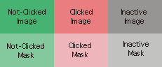
The picture is made up of a grid of one or more images. All images have the same width and height.
Only one image is required; if only one image is supplied, it will be used for drawing all states of the knob. Additional images are placed to the right of the first image. You can add images for either or both the "clicked" or inactive states of the control. The "clicked" image will be shown when the user is dragging the control's knob. The inactive image will be used after the control has received an active 0 message.
Image masks can be used to create knobs with non-rectangular outlines. These masks are directly below their corresponding images in the picture file. If you wish to use masks for any of the knob images, you must provide masks for all of them--each image will have a corresponding row of masks. Black pixels in the mask image create areas of the corresponding image that will be drawn, and white pixels create invisible areas.
Background picture files can be in PICT format, or if QuickTime Version 3.0 or later is installed, one of the other graphics file formats listed in the QuickTime appendix. Background picture files must have the following layout:
Only one image is required; if only one image is supplied, it will be used for drawing all states of the background. Additional images are placed to the right of the first image. You can add images for the inactive state of the control. The inactive image will be used after the control has received an active 0 message.
Knob files must be in PICT format with the following layout:
The picture is made up of a grid of one or more images. All images have the same width and height.
Only one image is required; if only one image is supplied, it will be used for drawing all states of the knob. Additional images are placed to the right of the first image. You can add images for either or both the "clicked" or inactive states of the control. The "clicked" image will be shown when the user is dragging the control's knob. The inactive image will be used after the control has received an active 0 message.
Image masks can be used to create knobs with non-rectangular outlines. These masks are directly below their corresponding images in the picture file. If you wish to use masks for any of the knob images, you must provide masks for all of them--each image will have a corresponding row of masks. Black pixels in the mask image create areas of the corresponding image that will be drawn, and white pixels create invisible areas.