chooser
Description
The chooser object is similar to the umenu object, but it displays a scrolling list of selectable items rather than a pop-up menu.
Examples
Arguments
None.
Attributes
autopopulate [int] (default: 0)
When the autopopulate attribute is enabled, the chooser object updates its item list whenever the prefix attribute is set with a path or the collection or filekind attributes are set with a database query. When autopopulate is disabled, changing the object's current folder or file query has no effect on the item list. However, if you enable autopopulate after changing the prefix, collection, or filekind attributes, the item list will immediately update.
bgcolor [4 floats]
Sets the background color of one of the chooser object's rows in RGBA format. The other row background color is set by the stripecolor attribute.
collection [symbol] (default: )
When the collection attribute is set to a collection name, the item list will be populated with the names of files contained in the named collection. You can define a collection of files using the File Browser.
Possible values:
''
'Lessons'
'Plug-ins'
'Sample Collection'
'Vizzie Control'
'Vizzie Effect'
'Vizzie Generate'
'Vizzie Input'
'Vizzie Mix-Composite'
'Vizzie Output'
'Vizzie Transform'
'Vizzie Utility'
depth [int] (default: 0)
If the value of depth is 0, only the files contained in the folder specified by prefix will be added to the item list. If depth is greater than zero, then items in subfolders of the prefix folder will be added to the list, with the folder names(s) prepended to them. Items in subfolders up to the level specified by the depth attribute are included.
enabledrag [int] (default: 1)
When the enabledrag attribute is enabled, you can drag a named file item in the list to any Max object that accepts it (such as a playlist~).
factorycontent [int] (default: 0)
When the factorycontent attribute is enabled, files added to the chooser via the use of the collection or filekind query will include example files that ship with the Max application.
filekind [symbol] (default: )
The filekind attribute permits you to build a list of chooser items containing all files of a specified type currently present in Max's search path. In order for the filenames to appear, the autopopulate attribute must be enabled.
Possible values:
''
'application'
'audiofile'
'audioplugin'
'bitmapandvectorfile'
'clipping'
'collective'
'dict'
'dictfile'
'file'
'gendsp'
'genexpr'
'genjit'
'helpfile'
'imagefile'
'java'
'javascript'
'jitterdatafile'
'json'
'lesson'
'livedevice'
'llllfile'
'lua'
'material'
'maxdatafile'
'maxforlive'
'maxpresets'
'maxsnapshot'
'midifile'
'model'
'moviefile'
'object'
'openexrfile'
'pass'
'patcher'
'preset'
'project'
'prototype'
'queryfile'
'reffile'
'rnbopat'
'sdiffile'
'shader'
'snippetfile'
'stringsfile'
'stylesheet'
'template'
'textfile'
'tutorial'
'vectorimagefile'
'video'
'vignette'
'webpage'
'xmlfile'
filtertext [symbol] (default: )
The filtertext attribute defines a text filter that modifies the list populated by the prefix, collection, or filekind attributes. Only files that contain the text in filtertext will be included in the chooser object's list. When filtertext is empty, no filtering occurs.
headerheight [int] (default: 0)
The headerheight attribute sets the height of the chooser object's header in pixels. By default the height is zero and the header is not shown.
headerlabel [symbol] (default: )
Header Label
items [atom]
The items attribute is used by the inspector to set the text of all the items in the list after you edit them. However, when changing this attribute with a message, you can only set the first item, so we recommend using a message followed by a series of messages to set a list of multiple items.
keynavigate [int] (default: 1)
The keynavigate attribute enables/disables letter key search navigation for chooser. When enabled (1) and the chooser object is selected, pressing a letter on your keyboard will cause chooser to select the item that begins with that letter. When disabled, key search navigation does not work. Disabling this attribute can be useful if you are using other key commands in your patch, such as with the key object.
margin [int] (default: 0)
The margin attribute sets the left and right text margins used when drawing the item text. When the margin attribute is 0, the object draws the text using a default margin equal to 80% of the currently used font's height.
multiselect [int] (default: 0)
When multiselect is enabled, the chooser object permits a user to select more than one item at a time by shift-clicking or command / control clicking. In addition, the multiselect attribute modifies how the chooser object sends selected items out its outlets. The first and third item index outlets will send the message followed by a list of one or more indices for each of the selected items. The second and fourth item contents outlets send the message followed by a list of one or more symbols with the contents of each of the selected items.
parameter_enable [int]
Enables use of this object with Max for Live Parameters and allows for setting initial parameter values in the Max environment.
parameter_mappable [int] (default: 1)
When parameter_mappable is enabled, the object will be available for mapping to keyboard or MIDI input using the Mappings feature.
prefix [symbol] (default: )
The prefix attribute specifies a file path that will be used to populate the list of items. A file will be included in the list if its name contains the text of the current value of the filtertext attribute and its type is included in the types specified by the types attribute. In addition the depth attribute controls whether files contained within any subfolders of the prefix folder are listed. In order for the contents of the folder designated by prefix set the item list, the autopopulate attribute must be enabled.
prefix_mode [int] (default: 0)
The prefix_mode attribute controls how the chooser object outputs the path location of a chosen filename when using prefix to list the contents of a folder.
Possible values:
0 = 'Concatenate'
The file name is combined with its containing folder name to create a single complete path name.
1 = 'Prepend'
The containing folder name is output as a separate symbol followed by the file name. This prefix mode cannot be used when multiselect is enabled.
2 = 'Ignore'
Only the file name is output.
preview [int] (default: 0)
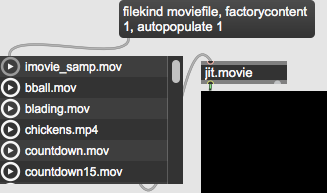
When the preview attribute is enabled, the chooser object shows a play button the to left of each item. If you connect the fifth outlet of chooser to an object that can play the type of file displayed in the list (sfplay~, jit.movie, or jit.playlist, clicking the play button next to an item will send commands to the connected object to begin playing the file specified by the item.
selectedclick [int] (default: 0)
When selectedclick is enabled, clicking on an already selected item reports that item. Otherwise items are only reported when the selection changes.
selectioncolor [4 floats]
Sets the background color of the chooser object's currently selected item in RGBA format. A custom background color for the selected item is only displayed if the useselectioncolor attribute is enabled.
showdotfiles [int] (default: 0)
Toggles the display of a any files whose names begin with a dot (period). The display of these files is normally supressed.
stripecolor [4 floats]
Sets the second (alternating) background row color in RGBA format. The other row background color is set by the bgcolor attribute.
style [symbol] (default: )
Sets the style to be used for the chooser object's visual display.
textcolor [4 floats]
Sets the text color of the chooser object in RGBA format.
types [atom]
The types attribute is used in conjunciton with the prefix attribute. It permits filtering files contained in the prefix folder according to one or more types. The types are four-character type codes as those used by the folder object such as AIFF, WAVE, TEXT, and JSON.
useselectioncolor [int] (default: 0)
Toggles the use of the selectcolor attribute to define a custom selection color.
Common Box Attributes
annotation [symbol]
Sets the text that will be displayed in the Clue window when the user moves the mouse over the object.
background [int] (default: 0)
Adds or removes the object from the patcher's background layer. adds the object to the background layer, removes it. Objects in the background layer are shown behind all objects in the default foreground layer.
color [4 floats]
Sets the color for the object box outline.
fontface [int]
Sets the type style used by the object. The options are:
plain
bold
italic
bold italic
Possible values:
0 = 'regular'
1 = 'bold'
2 = 'italic'
3 = 'bold italic'
fontname [symbol]
Sets the object's font.
fontsize [float]
Sets the object's font size (in points).
Possible values:
'8'
'9'
'10'
'11'
'12'
'13'
'14'
'16'
'18'
'20'
'24'
'30'
'36'
'48'
'64'
'72'
hidden [int] (default: 0)
Toggles whether an object is hidden when the patcher is locked.
hint [symbol]
Sets the text that will be displayed in as a pop-up hint when the user moves the mouse over the object in a locked patcher.
ignoreclick [int] (default: 0)
Toggles whether an object ignores mouse clicks in a locked patcher.
jspainterfile [symbol]
JS Painter File
patching_rect [4 floats] (default: 0. 0. 100. 0.)
Sets the position and size of the object in the patcher window.
position [2 floats]
Sets the object's x and y position in both patching and presentation modes (if the object belongs to its patcher's presentation), leaving its size unchanged.
presentation [int] (default: 0)
Sets whether an object belongs to the patcher's presentation.
presentation_rect [4 floats] (default: 0. 0. 0. 0.)
Sets the x and y position and width and height of the object in the patcher's presentation, leaving its patching position unchanged.
rect [4 floats]
Sets the x and y position and width and height of the object in both patching and presentation modes (if the object belongs to its patcher's presentation).
size [2 floats]
Sets the object's width and height in both patching and presentation modes (if the object belongs to its patcher's presentation), leaving its position unchanged.
textcolor [4 floats]
Sets the color for the object's text in RGBA format.
textjustification [int]
Sets the justification for the object's text.
Possible values:
0 = 'left'
1 = 'center'
2 = 'right'
varname [symbol]
Sets the patcher's scripting name, which can be used to address the object by name in pattr, scripting messages to thispatcher, and the js object.
Parameter Attributes
Order
Sets the order of recall of this parameter. Lower numbers are recalled first. The order of recall of parameters with the same order number is undefined.
Parameter Mode Enable
Parameter Mode Enable (not available from Parameters window)
Link to Scripting Name
When checked, the Scripting Name is linked to the Long Name attribute.
Long Name
The long name of the parameter. This name must be unique per patcher hierarchy.
Short Name
Sets the short name for the object's visual display. The maximum length varies according to letter width, but is generally in a range of 5 to 7 characters.
Type
Specifies the data type. The data types used in Max for Live are:
Float
Int
Enum (enumerated list)
Blob
Note: By convention, the Live application uses floating point numbers
for its calculations; the native integer representation is limited to 256
values, with a default range of 0-255 (similar to the char data type used
in Jitter). When working with Live UI objects whose integer values will
exceed this range, the Type attribute should be set to Float,
and the Unit Style attribute should be set to Int.
Range/Enum
When used with an integer or floating point data type, this field is
used to specify the minimum and maximum values of the parameter.
When used with an enumerated list (Enum) data type, this field contains
a space-delimited list of the enumerated values (if list items contain a
space or special characters, the name should be enclosed in double
quotes).
Clip Modulation Mode
Sets the Clip Modulation Mode used by the Live application. The modulation
modes are:
None
Unipolar
Bipolar
Additive
Absolute
Clip Modulation Range
This parameter is only used with the Absolute modulation mode. It specifies defines the range of values used.
Initial Enable
When checked (set to 1), the UI object can store an initialization value. The value is set using the Initial attribute (see below).
Initial
Sets the initial value to be stored and used when the Initial Enable attribute is checked.
Unit Style
Sets the unit style to be used when displaying values. The unit style
values are: Int: displays integer values
Float: displays floating point values
Time: displays time values in milliseconds (ms)
Hertz: displays frequency values (Hz/kHz).
deciBel: displays loudness (dB)
%: Percentage
Pan: displays Left and Right values
Semitones: displays steps (st)
MIDI: displays pitch corresponding to the MIDI note number
Custom: displays custom data type
Native: defaults to floating point values
Custom Units
Sets the units to be used with the 'Custom' unit style (see "Unit Style", above). Custom unit strings may be simple symbols (e.g. "Harmonic(s)"), in which case the parameter's value will be displayed in its 'Native' display mode, followed by the symbol (e.g. "12 Harmonic(s)" for an Int-typed parameter or "12.54 Harmonic(s)" for a Float-typed parameter). For additional control over the numerical component displayed, a sprintf-style string may be used (e.g. "%0.2f Bogon(s)", which would display a value such as ".87 Bogons").
Exponent
When set to a value other than 1., the parameter's input and output values will be exponentially scaled according to the factor entered in this column.
Steps
The number of steps available between the minimum and maximum values of a parameter. For instance, if the parameter has a range from 0.-64., with Steps set to 4, the user can only set the parameter to 0, 21.33, 42.66 and 64.
Parameter Visibility
For automatable parameters (Int, Float, Enum), 'Stored Only' disables automation, although parameter values are stored in presets. 'Hidden' causes the parameter's value to be ignored when storing and recalling data. Non-automatable parameters (Blob) are 'Stored Only' by default, and can be set to 'Hidden', if desired.
Update Limit (ms)
Speed limits values triggered by automation.
Defer Automation Output
Defers values triggered by automation.
Messages
bang
int
Arguments
float
Arguments
anything
Arguments
append
Arguments
clear
count
delete
Arguments
deselect
dictionary
Arguments
"items" : [ "hank", "carol", "andreas", "roland" ]
insert
Arguments
message [list]
(mouse)
next
play
Arguments
prev
progress
Arguments
set
Arguments
setnext
setprev
sort
Arguments
stop
See Also
| Name | Description |
|---|---|
| umenu | Pop-up menu |
| sfplay~ | Play audio file from disk |
| folder | List the files in a folder |
| jit.playlist | Play video files |
| playlist~ | Play sound files |