Examples

Produce output by dragging onscreen... or display numbers passing through
Output numbers by moving a slider onscreen
| bang | Sends out the number currently stored in the slider. | |
| int | input [int] |
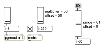
The number received in the inlet is displayed graphically by slider, and is passed out the outlet. Optionally, slider can multiply the number by some amount and add an offset to it, before sending it out the outlet. |
| float | input [float] |
Converted to . |
| (mouse) | Clicking and dragging with the mouse causes will change the position of the slider and send a number value out the object's outlet. | |
| set | set-input [list] |
The word , followed by a number, resets the value displayed by the slider, without triggering output. |
| setminmax | low-and-high-values [list] |
The word , followed by two numbers, sets the low and high range values for the slider object. The floatoutput attribute will automatically be set. |
| Name | Type | g/s | Description |
|---|---|---|---|
| bgcolor | float | Sets the slider background color in RGBA format. | |
| bordercolor | float | Sets the slider border color in RGBA format. | |
| floatoutput | int def.:0 |
Toggles floating-point output from the slider object. The default is 0 (off). | |
| knobcolor | float | Sets the slider knob color in RGBA format. | |
| min | float def.:0. |
Sets value that will be added to the slider object's value before it is sent out the outlet. | |
| mult | float def.:1. |
Specifies a multiplier value. The slider object's value will be multiplied by this number before it is sent out the outlet. The multiplication happens before the addition. The default value is 1. | |
| orientation | int def.:0 |
Sets the slider object to a horizontal or vertical data display. 0 : (the default) sets the display dependent on the size of the slider - longest side of the rectangle that describes the slider sets the orientation. 1 2 |
|
| relative | int def.:0 |
Sets the way that the slider object responds to mouse clicks. In relative mode (the default) the slider keeps its relative position when you click - Moving the mouse outputs higher or lower values in relation to that relative position. In absolute mode, the slider will automatically jump directly to the clicked location. | |
| size | float def.:128. |
Sets the number of steps (range) of the slider object. The default value is 128. Setting the size to 1 disables the slider visually (since it can only display one value). Any specified size less than 1 will be set to . | |
Legacy | |||
| brgba | list (3 ints) | is a legacy RGB alias for the bgcolor RGBA attribute. See here for more information. | |
| frgba | list (3 ints) | is a legacy RGB alias for the knobcolor RGBA attribute. See here for more information. | |
| rgba2 | list (3 ints) | is a legacy RGB alias for the bordercolor RGBA attribute. See here for more information. | |
| Name | Description |
|---|---|
| Color | Choosing the Color... menu item from the Object menu when the object is selected opens a color picker, permitting adjustment to the appearance of the slider object. |

| Name | Description |
|---|---|
| dial | Output numbers by moving a dial onscreen |
| kslider | Output numbers from a keyboard onscreen |
| multislider | Multiple slider and scrolling display |
| nslider | Output numbers from a notation display onscreen |
| pictctrl | Picture-based control |
| pictslider | Picture-based slider control |
| rslider | Display or change a range of numbers |
| Max Basic Tutorial 7: Numerical User Interfaces | Max Basic Tutorial 7: Numerical User Interfaces |