A newer version of Max is available. Click here to access the latest version of this document.

pictctrl

Picture-based control

Description

The pictctrl object is a user interface object for creating buttons, switches, knobs, and other controls. Since the pictctrl object uses images from a picture file for its appearance, you can create controls with whatever appearance you desire.

Note: The pictctrl object object customarily uses images saved in Portable Network Graphics (.png) format. If you are using Max on Windows, we recommend that you install QuickTime and choose a complete install of all optional components to work with images other than PNG or PICT files.

Arguments

None.

Messages

bang Sends the current value of the pictctrl to the outlet.
int input [int]
Sets the value of the button or knob set by the control, and sends the current value out the outlet. In button and toggle mode, the value must be either 0 or 1. In dial mode, the range of values is determined by pictctrl object's Range attribute.
float input [float]
Converted to int.
(drag) When a image file is dragged from the Max 5 File Browser to a pictctrl object, the image will be loaded.
(mouse) Clicking on the pictctrl object and dragging sends the current value out the outlet. Additional behaviors depend on how the object is configured using messagse or setting attributes using the Inspector.
link filename [symbol]
The word link, followed by a filename to a file which has already been loaded into the pictctrl object will link the object with that file.
picture imagefile-name [list]
The word picture followed by the name of an image file will read that file into the pictctrl object. The word with no name following opens a standard file dialog for choosing an image file.
set input [int]
The word set, followed by a number, sets the value of the button or knob to that number, without triggering output.
read filename [list]
The word read followed by the name of an image file will read that file into the pictctrl object. The word with no name following opens a standard file dialog for choosing an image file.
readany filename [list]
The word readany followed by the name of a file will read any type of file into the pictctrl object and attempt to interpret it as a picture.

Attributes

Name Type g/s Description
active int
def.:1
Toggles mouse control of the pictctrl object. The default is 1 (enabled). If a separate set of inactive images is present in the pictctrl object's picture file and if the inactive images attribute is set, the active message will also change the appearance of the control.
clickedimage int
def.:0
Toggles the use of an alternate set of image frames in your picture file to give the dial a different appearance when the user clicks on it and drags the mouse pointer. clickedimage 0 disables this feature.
clickincrement int
def.:0
Sets the output value to increment by 1 each time the object is clicked (Click to Increment mode). Any movement of the mouse after clicking is ignored. When the uppermost value is reached, the value returns to zero with the next click. All other mouse tracking modes are disabled. clickincrement 0 disables Click to Increment mode.
clip int
def.:1
Causes pictctrl, while in dial-mode, to clip mouse-movement within the range of the dial. When followed by a 0, pictctrl will wrap around to the minimum when it surpasses the maximum value (within the range of the dial) and vice versa to the maximum when it surpasses the minimum value.
degrees int
def.:270
Specifies the degree-of-rotation pictctrl has while in dial-mode.
frames int
def.:10
Specifies the number of images (columns) in the picture file. The number of frames does not have to be the same as the range of the control; the pictctrl object will use the nearest image for any given value.
imagemask int
def.:0
When non-zero, indicates that your picture file has an image mask. The default is 0 (no image mask). This attribute is present for legacy support - it has been superseded by the use of alpha channels in images.
inactiveimage int
def.:0
When non-zero, indicates that your picture file has an additional row of images for its inactive state. The default is 0 (no inactive state).
mode int
def.:0
Selects mode of operation for the pictctrl object.
0 Button (the default)
1 Toggle
2 Dial mode
multiplier int
def.:0
Sets a multiplier value. When pictctrl is in dial mode, the object's value is multiplied by this number before being sent out the outlet. The multiplication happens before the addition of the Offset value. The default multiplier value is 1.
name symbol
def.:<default>
Designates the graphics file that the pictctrl object will use will use for the control's button or dial file. By convention, the pictslider object uses images saved in Portable Network Graphics (.png) format. If you are using Max on Windows and want to to work with images other than PNG or PICT files, we recommend that you install QuickTime and choose a complete install of all optional components. The symbol used as a filename must either be the name of a file in Max's current search path, or an absolute pathname for the file (e.g. "MyDisk:/Documents/UI Pictures/CoolButton.png").
offset int
def.:0
Sets an offset value. When pictctrl is in dial mode, the offset value is added to the object's value before being sent out the outlet. The default offset value is 0.
range int
def.:128
Sets the range of the pictctrl object when it is in dial mode. The default value is 128.
ratio int
def.:2
Specifies how many pixels the mouse pointer must move before the value of the dial changes by one increment. If the pictctrl object is using Circular Tracking, the ratio message specifies how many degrees the cursor must move, relative to the center of the object, to increase the value by one.
snap int
def.:0
Sets pictctrl to snap to the image's original size. When followed by a 0, pictctrl will not snap to the image's original size.
threshold int
def.:0
Sets the button Alpha hit threshold.
trackcircular int
def.:0
Sets the pictctrl object to respond when you click on it and drag the mouse in a circular arc relative to the control's center (Circular Tracking mode). Moving the mouse clockwise increases the control's value, and moving it counterclockwise decreases its value. Enabling circular tracking disables all other tracking modes. trackcircular 0 disables circular tracking.
trackhorizontal int
def.:0
Sets the pictctrl object to respond when you click on it and drag the mouse horizontally; moving the mouse to the right increases the object's value, and moving it to the left decreases the value. Enabling this mode of operation disables the Circular Tracking and Click to Increment modes (see the clickincrement and trackcircular messages).
tracking int
def.:0
Toggles live tracking. If live tracking is on, the pictctrl object will change its state if the mouse moves in and out of the rectangular border of the object with the mouse button held down. tracking 0 disables live tracking
trackvertical int
def.:0
Sets the pictctrl object to respond when you click on it and drag the mouse vertically; moving the mouse up increases the object's value, and moving it down decreases the value. Enabling this mode of operation disables the Circular Tracking and Click to Increment modes (see the clickincrement and trackcircular messages).

Information for box attributes common to all objects

Picture File Format

Specifications: When you create a new pictctrl object in a patcher window, it has no associated picture file. Use the Open button in the Inspector to choose a picture file for the control. By convention, the pictctrl object uses images saved in Portable Network Graphics (.png) format. If you are using Max on Windows and want to to work with images other than PNG or PICT files, we recommend that you install QuickTime and choose a complete install of all optional components. The layout of the picture in the file varies depending on which mode of operation the pictctrl uses. All three modes require that the pictures be made up of a grid of images, in which all images have the same width and height.

Button mode has the simplest layout:
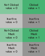


The first row of images is mandatory: these two images are used for the idle and clicked states (values zero and one, respectively) of the button. The next row of images, if present, is used for the control when it is in its inactive state. The next rows contain the masks for the top row of images, and the inactive images if present.

Toggle mode has a similar layout:
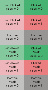


In this mode, the top two rows are mandatory. The first row of images are used when the control's value is zero, the next row when its value is one. The third row is optional; it is used for the control when it is in its inactive state. (Note that there are no "clicked" images for the inactive state, since when inactive, the control ignores mouse clicks.) The next rows contain masks for the images.

The Dial mode layout varies in size depending on how many image frames it has, which must be the same as the Image Frames parameter as set in the inspector:
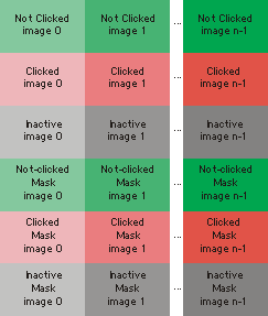


The first row of images is mandatory: one image for each visually distinct state of the control. Dials need as many picts as you wish them to have visible states. Note that dials can receive and send a larger range of values than are represented by picts (e.g. your dial can have a range of 128 even if you only use eight pict frames to represent the range of the dial). The next row of images is optional, and is used when the user is clicking and dragging on the object to change its value. The next row is also optional; (Note that there are no "clicked" images for the inactive state, since when inactive, the control ignores mouse clicks.) The following rows contain masks for the images.
Output

int: The current value of the pictctrl object. In toggle and button modes this will be a 0 or a 1. In dial mode, this value is specified by the range, offset, and multiplier that you set in the Inspector window.

Examples

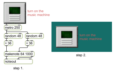
Create customized controls to create a more attractive user interface

See Also

Name Description
dial Output numbers by moving a dial onscreen
kslider Output numbers from a keyboard onscreen
matrixctrl Matrix switch control
pictslider Picture-based slider control
rslider Display or change a range of numbers
slider Output numbers by moving a slider onscreen
tab A user interface tab/multiple button object
textbutton A user interface button/toggle
ubutton Transparent button, sends a bang
Max Interface Tutorial 2: Picture UI Elements Max Interface Tutorial 2: Picture UI Elements