Color bit depth
In the digital domain, colors are represented using numerical values, typically in three or more dimensions. For each pixel of an image, your computer allocates a certain amount of memory to represent the color values. Color bit depth refers to the number of bits of memory used to represent the color of a single pixel, and it determines the number of distinct colors values or shades that a pixel can assume:
- 1-bit: Can represent 2 values (black or white).
- 8-bit: Can represent 256 values.
- 16-bit: Can represent 65,536 values.
- 24-bit: Can represent 16,777,216 values.
- 32-bit: Can represent 4,294,967,296 values.
In Jitter, we can decide the color bit depth for a generated image or convert the bit depth of an existing one.
For example, the object jit.noise with @planecount 3, @type char, and @dim 100, for each cell of the Jitter matrix, produces 3 color values using 8 bits of memory each (a char is 8 bits), for a total of 24 bits of color information. Each component of the RGB encoded color can assume 256 distinct values for 16,777,216 possible color combinations. This is often called True Color, as it’s sufficient for most applications to represent realistic images with smooth color transitions.
If 8 bits per channel (char) is sufficient for representing all visible colors, why do we even need higher bit depths? Let's try to apply some operations on a char Jitter matrix:
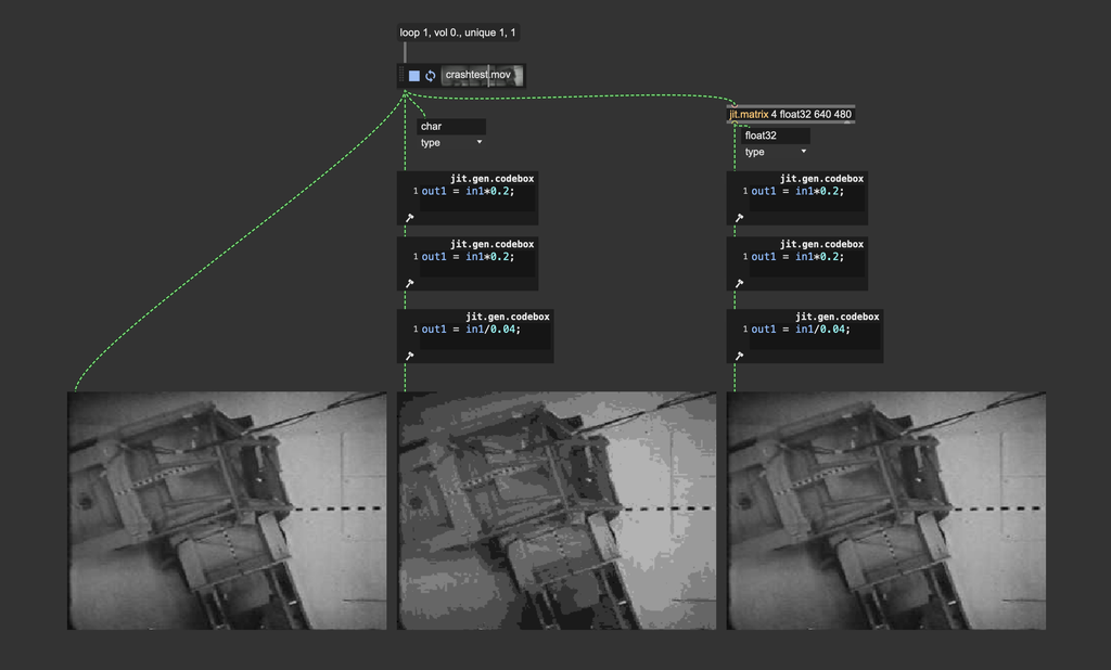
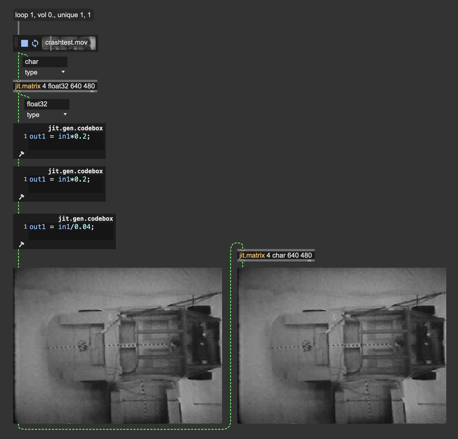
The image we get after this process should be mathematically identical to the input image (), but you can tell they're different. This happens because although 16,777,216 possible color combinations are enough to represent all visible colors, the color values are truncated at each step of the process.
To make an even more extreme example, let's assume 1-bit color values. If such a value is , and we multiply it by the result of this operation can't be , but only or (depending on how the value gets rounded).
So, higher bit depths are needed during intermediate image processing, when more precision is needed for mathematical operations.
You should always use float32, or at least float16 matrices/textures for image processing.
Once your process has finished, you can safely reduce the bit depth of your image if you need to use smaller storage space, for example, and the result won't change noticeably.
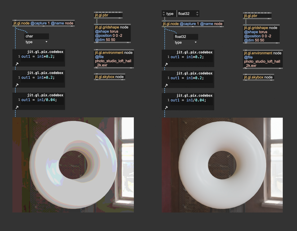
The same principles apply when capturing a render to a texture: The attribute @type of jit.gl.node must be set to "float16" or "float32" if we want to process the captured texture further.
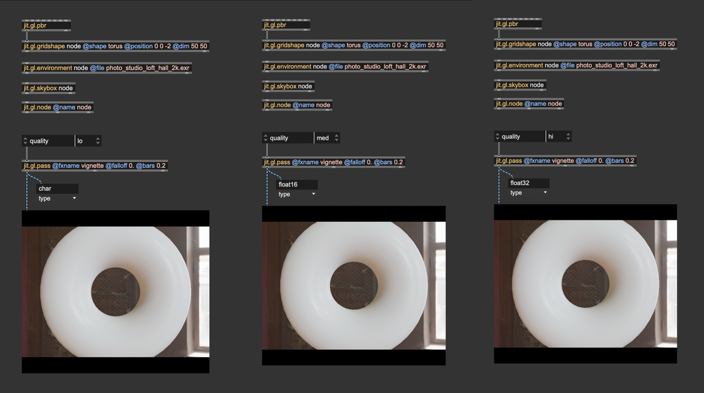
Things are different when we use jit.gl.pass; this object is used to apply post-processing effects on a 3D scene rendered to a texture. To control the bit depth of the internal processing, there's a @quality attribute: @quality "lo" = char, @quality "med" = float16 (the default), @quality "hi" = float32.
Color spaces and gamma correction
As we said in the previous paragraph, colors are expressed through numerical values in the digital world, often spanning three or more dimensions. Devices such as screens, printers, and cameras interpret these values to display visible colors. The RGB color model is the most commonly used representation. As you likely know, RGB stands for Red, Green, and Blue, the three primary color components combined to reproduce a wide range of colors from the visible spectrum. When all three components are combined at full intensity, they produce white light.
The problem is that the RGB color encoding is somehow abstract. Each device may interpret the numerical values differently, resulting in inconsistent results across different devices. For this reason, when we talk about colors, we usually refer to a so-called color space.
Color spaces are systems used to represent and organize colors consistently and measurably. They define how colors can be described in various contexts, whether on a screen, in print, or during digital processing. Color spaces ensure that colors appear as intended, regardless of the device.
Nowadays, most devices (TVs, phones, computer monitors, projectors) use the sRGB color space (Standard Red, Green, Blue). Understanding how sRGB works is essential to assign colors to pixels correctly.
Why sRGB?
Human vision is more sensitive to changes in darker tones than in brighter tones. In other words, we can detect more subtle differences in shadowed areas than in highlights.
Given the limited number of shades that a color may assume in the digital domain (e.g., 256 × 256 × 256 = 16,777,216 possible colors with 8-bit color data), it makes sense to "spend" more precision on darker tones than on brighter ones to match the human color perception better. If brightness were linearly represented, most of the color data would be concentrated in the bright parts of the image, and the darker parts would lack detail.
How does sRGB "distribute" precision where it's needed most? It applies a so-called gamma correction curve, which re-maps the RGB values to match human eye perception better. The gamma curve in sRGB compensates for the non-linear way human eyes perceive brightness, making images appear more natural on screens. It optimizes digital data by spreading information more evenly across the range of brightness levels we perceive.
A piece-wise function defines the gamma correction curve:
The function above transforms the linear RGB colors into sRGB colors. It's also possible to convert colors back from sRGB to linear RGB:
If you'd like to check out an implementation of these functions, you can see the shader "hdr.gamma.jxs".
Most of the time, for efficiency and simplicity, an approximate gamma correction function is preferred over the ones above:
These gamma correction curves are very popular and widely used in computer graphics applications because they're more straightforward than the original piece-wise function, and the difference is visually negligible.
How and where should I apply gamma correction?
Let's put it this way: computers must operate on RGB colors. They don't care at all about our funky color perception, they need to process color values as they are. Screens, on the other hand, expect to receive color values encoded in sRGB color space. So, gamma correction must always be used as the last step of any graphic pipeline. Before sending a Jitter matrix or a texture to the display, we should convert the linear RGB into sRGB.
In Jitter, this can be done in a variety of ways:
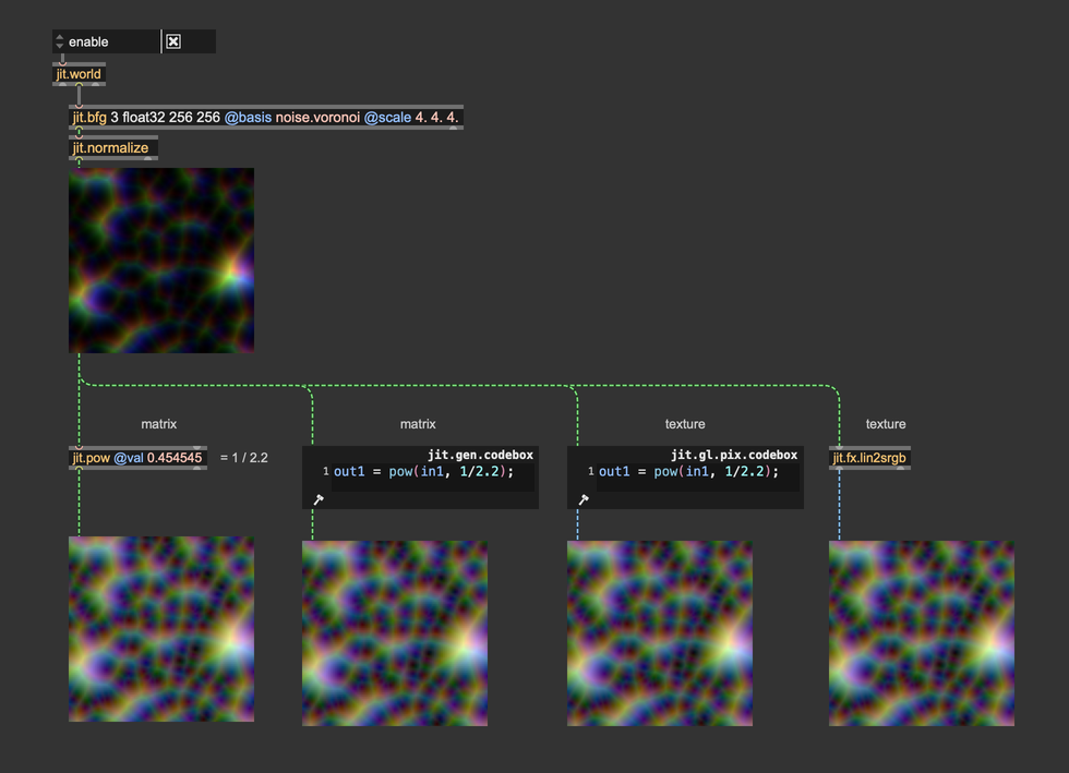
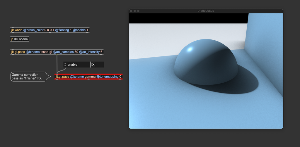
Gamma correction must always be the last effect before sending a matrix or a texture to the display (jit.world, jit.pworld, jit.window, jit.pwindow).
Let's now talk about the difference that it makes. Let's see the last image with and without gamma correction:
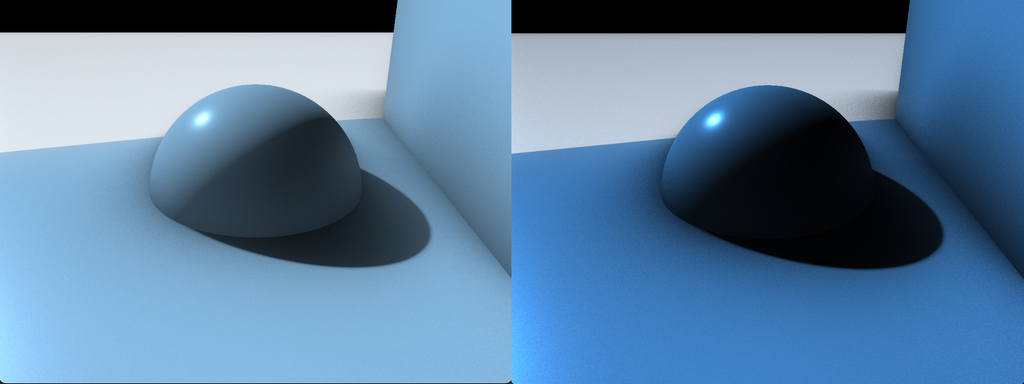
The difference is dramatic; the gamma-corrected image on the left seems more natural and "believable" than the non-gamma-corrected image on the right. Dark details are more distinguishable, and it doesn't look too dark and oversaturated like the image on the right. It's not just a matter of brightness—even if we increase the color values of the image on the right to match the brightness of the image on the left, the colors still look weird and unnatural:
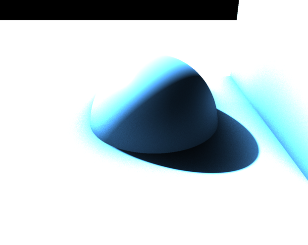
As you’ve seen, gamma correction can significantly alter colors. We recommend adding gamma correction to your Jitter scene as soon as you start working, and designing your patch around the gamma corrected colors. If you apply gamma correction later and have already balanced colors without it, you may end up needing to redo your color adjustments from scratch.
Gamma corrections in a chain of effects
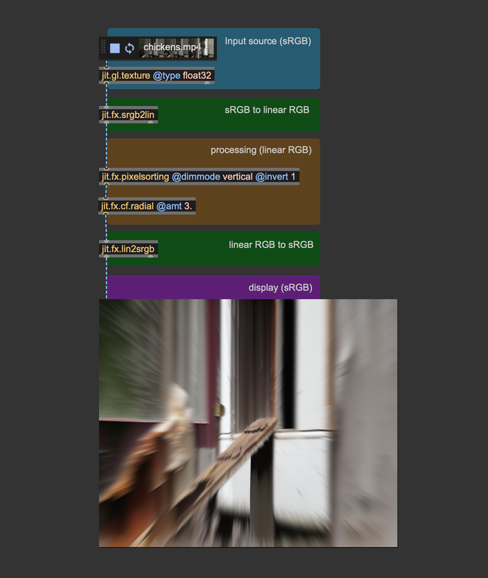
We said that gamma correction must be applied last, but we should also convert any input image or video from sRGB to linear RGB before processing them.
When images or videos are stored on your computer, their colors are in sRGB color space; therefore, to make a correct image processing chain, we must follow these steps: input image -> sRGB to linear RGB -> image processing -> linear RGB to sRGB -> display
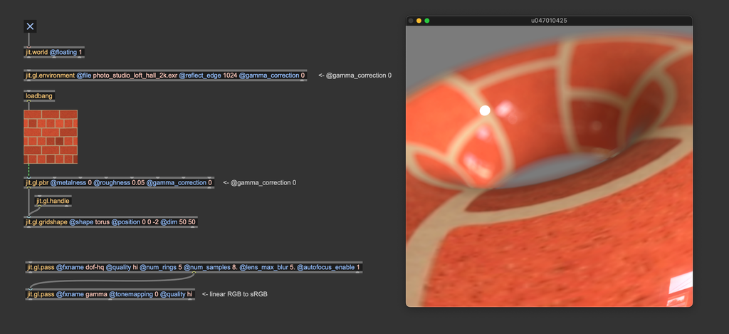
Both jit.gl.pbr and jit.gl.environment have a @gamma_correction attribute, which is enabled by default. This attribute applies gamma correction at the end of the shading process.
This @gamma_correction shortcut makes things look better by default, but now that you know how gamma correction works, we suggest that you turn @gamma_correction off and use proper color space conversions "manually." This way, any process that happens after the rendering (for example, a pass FX made with jit.gl.pass) will operate in the correct linear RGB color space.
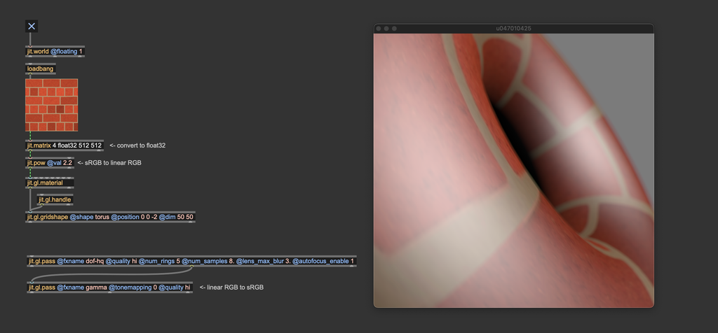
Theoretically, you should convert the bricks texture from sRGB to linear RGB before using it for something. We're not doing it here because jit.gl.pbr internally converts the textures to the correct color space automatically. If we would have used jit.gl.material instead, or any custom shader that applies a texture to a mesh, we should have taken care to convert textures to the correct color space first.
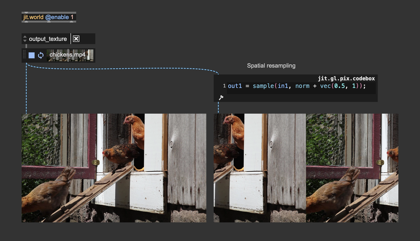
Color space conversion is NOT needed in the case of simple playback and spatial resampling. Convert color spaces only if you have to work on the image's colors.
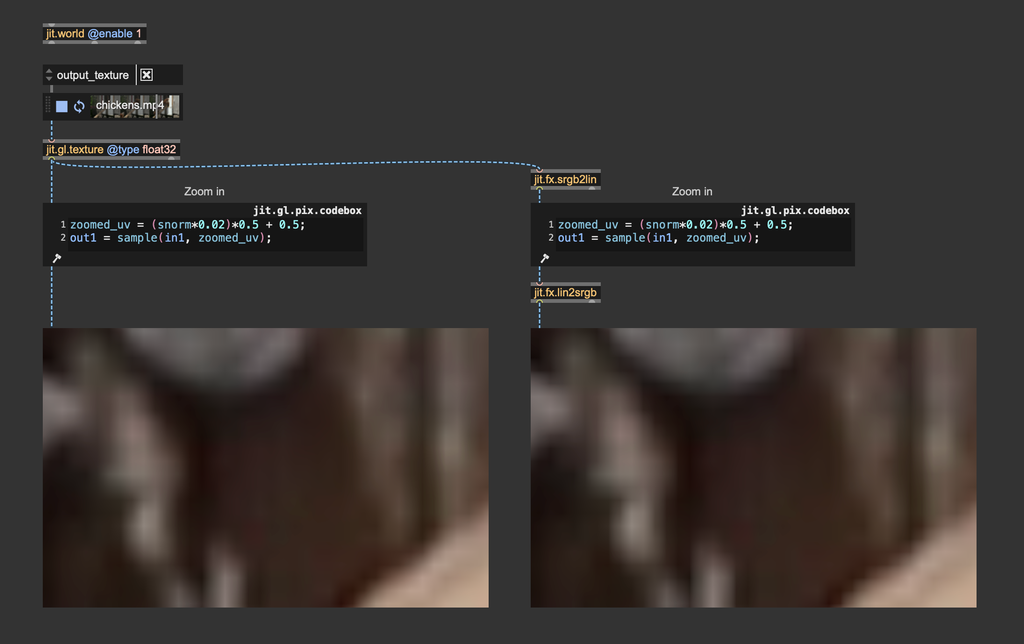
When performing a zoom operation, on the other hand, the process interpolatates pixels' color values, hence requiring a color space conversion. In practice, the difference is visually neglibigle, and the color conversion can usually be skipped. Here's a zoom-in performed with and without color space conversion—it's hard to see the difference
Light intensity and tonemapping
Let's say we want to create an outdoor scene illuminated by a bright summer sun. Let's set it up:
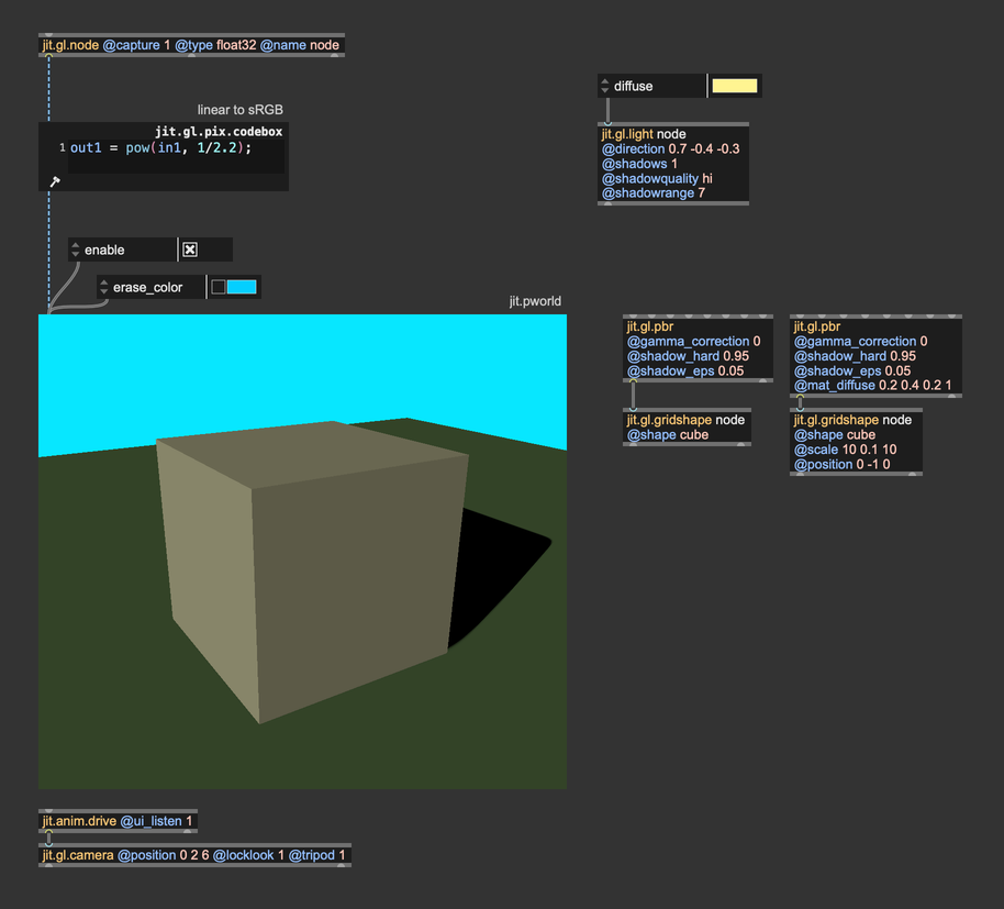
It's a straightforward patch, but there are a couple of things we should focus on. First of all, we've disabled @gamma_correction on both jit.gl.pbr objects, and we're computing the color space conversion manually using jit.gl.pix.codebox. Don't worry about the other settings of jit.gl.pbr, we'll talk about those in another chapter.
We said we wanted a bright, sunny day, but honestly, the result looks kind of dull and dark. We set the @diffuse attribute of jit.gl.light to a color that resembles sunlight, but it doesn't seem enough to get the effect we were after. It doesn't look like an outdoor scene because the light isn't intense enough. This brings us to a key concept:
Light color is NOT light intensity.
When we set the @diffuse attribute of jit.gl.light, what we are setting is the light's emitted energy. If we want to have a light of arbitrary intensity, we should take the color values and multiply them by an intensity value. Let's see what it looks like now:
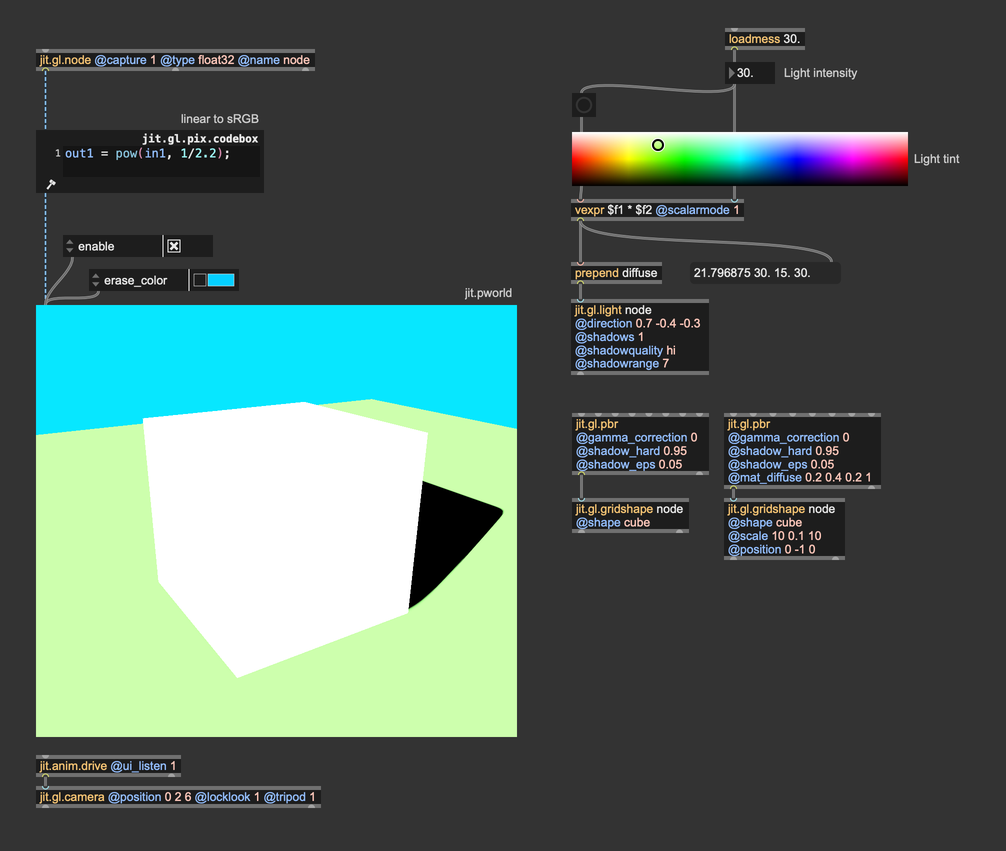
We're using the swatch object to choose the light tint, and we multiply each component of the color value by an intensity parameter. This way, the light we get resembles sunlight much more. This brings us to yet another important concept:
You should think in terms of light energy, not in terms of light color.
When we set the @diffuse attribute of jit.gl.light we are expressing how much energy comes from the light source -> how much red, how much green, and how much blue. If you look at the values in the message box below the vexpr object, you'll see that the values go past 1. So, don't be afraid to crank these numbers up!
The light intensity looks correct, but we lost all the details on the shape: the image looks burnt! Let's take a look at the values that are being sent to jit.pworld. Here's a simple utility to better demonstrate the values that jit.pworld receives:
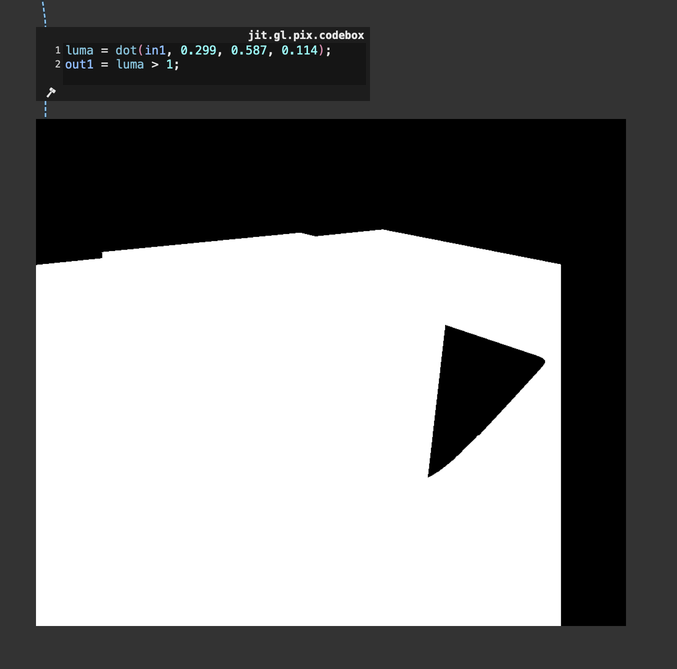
This jit.gl.pix.codebox converts the rendered image's RGB values to luminance and then compares that luminance to 1: if it exceeds 1, the utility displays a white pixel; if not, it shows a black pixel. With this straightforward test, we can see that jit.pworld is indeed receiving values greater than 1, which results in displaying only white. Essentially, this means colors are clipped, as no color can appear brighter than pure white. Once again, we're in a spot where our rendering looks unnatural. The light intensity seems convincing, but we've lost all the shape details because of color clipping. What can we do then?
Another essential color correction tool comes into play here: tonemapping.
Tonemapping is a technique used to convert high-dynamic-range (HDR) images with a wide range of luminance values into a format that can be displayed on low-dynamic-range (LDR) devices like standard monitors, televisions, or printed media. The goal of tonemapping is to compress the wide range of brightness levels in an HDR image into a range that can be adequately displayed on these devices while still conveying the perceived brightness and contrast of the original scene.
Tonemapping involves using mathematical functions or algorithms that compress the HDR luminance (brightness) range into a more limited one. This process can be done in several ways, depending on the desired artistic or visual effect. One ubiquitous tonemapping curve is Reinhard Tonemapping. This curve equally affects R, G, and B channels and works as an "intensity limiter." The Reinhard tonemapping curve corresponds to the function , and this is its plotted graph:
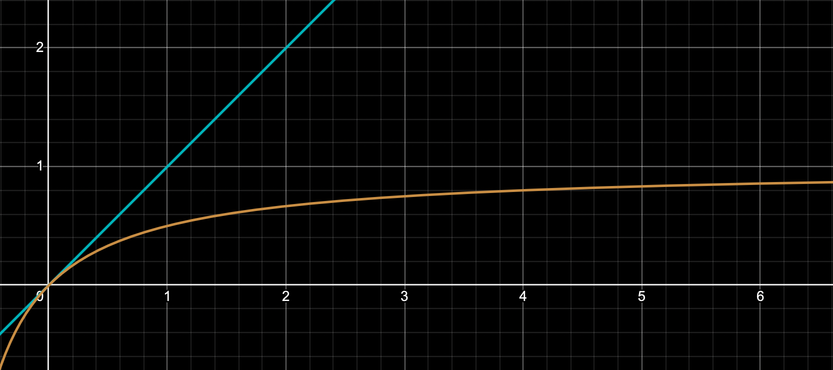
The blu line represents colors without tonemapping, and the orange curve shows the Reinhard tonemapping function. As you can see, this function cannot grow past 1, as . Let's try then to apply this tonemapping function to our scene:
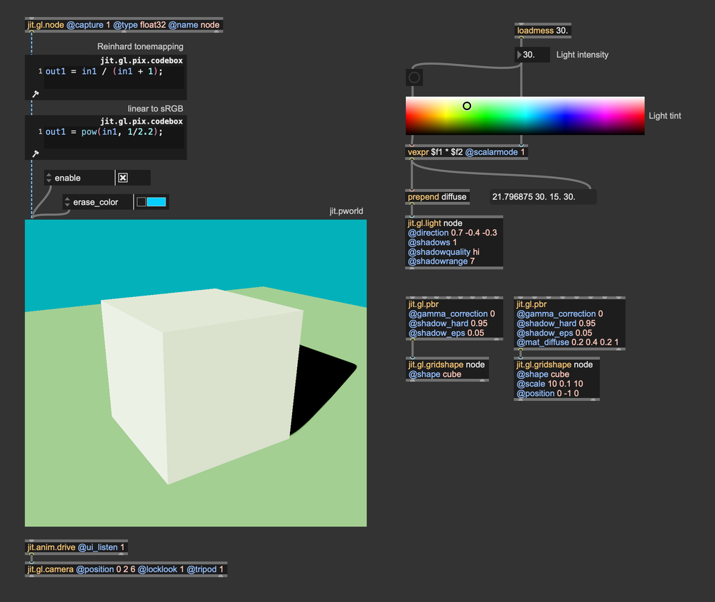
With the tonemapping function in place, the color details on the cube are back, and we can still perceive the intense brightness of the light source. Look at where i placed the tonemapping function and the gamma correction function. The order for these two "finisher" effects matters and must always be the same:
Tonemapping first, then gamma correction.
What if we want to avoid writing the tonemapping and the gamma correction functions every time? We can again use the jit.gl.pass effect named gamma.
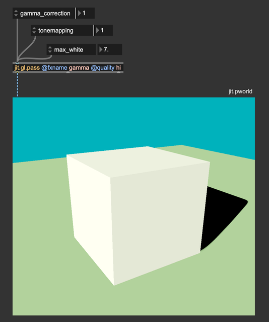
It implements both color correction curves, and you can choose between two gamma correction functions (approximate and accurate) and among four tonemapping curves (Reinhard, Renhard-Jodie, ACES, and Uncharted2). We invite you to experiment with these functions and find the one that looks better for your scene.
In conclusion, gamma correction and tonemapping are fundamental to translating the complexities of light and color into visually compelling and realistic images, ensuring that what we see on screen aligns with both artistic intent and the physical behavior of light.
In summary
- Use float32, or at least float16 matrices/textures for image processing.
- Use
@quality"hi" for jit.gl.pass whenever possible, and make sure all chained jit.gl.pass share the same@qualitysetting. - Gamma correction must always be the last effect before sending a matrix or a texture to the display.
- Color space conversion is not needed in the case of simple playback and spatial resampling.
- When setting jit.gl.light
@diffuse, don't think of it as a color, but as the amount of energy emitted per red, green, and blu wavelengths. - Tonemapping must always come before gamma correction.
To learn more about
Gamma correction:
- https://learnopengl.com/Advanced-Lighting/Gamma-Correction
- https://www.cambridgeincolour.com/tutorials/gamma-correction.htm