Color Palette
The color palette lets you select and edit colors used by Max objects. There are two types of colors used in Max, fixed and dynamic. Fixed colors are specified by RGB color values -- for example, black is 0, 0, 0 -- while dynamic colors are specified by name, and may change dynamically when the Max or Live theme changes.
You can use the color palette to select either fixed and dynamic colors. Certain color attributes in Max objects can also be specified as gradients -- continuous transitions between two fixed colors.
Displaying the Color Palette
The color palette can be accessed in two places, the Inspector or the Format Palette.
Colors in the Inspector
With a user interface object such as a button or toggle selected, open the Inspector. You'll see some color attributes:
Click any of the color swatches next to the name of the attribute. The Color Palette will open.
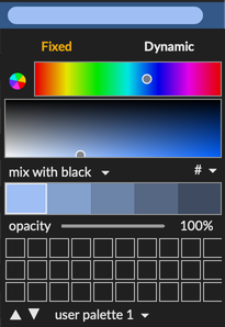
Colors in the Format Palette
Select a user interface object, then click the format palette icon in the top toolbar.

The format palette will open. Click any of the colors shown, and the color palette will drop down to edit that color.
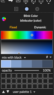
Picking a Fixed Color
Select the Fixed tab at the top of the color palette if it is not already showing.

The top control shows the current color within a hue space.

The middle control shows the current color within a brightness and saturation space. Click and/or drag in either space to modify the current color. The Max object's color changes as you drag.
Below the color editors, you'll find some variation controls. By default, the chosen variation is mix with black. When you click on mix with black, you'll see a menu with other color variations.
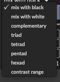
Here's Pentad, which creates five variations of the selected color according to hue.

Click on any color variant to make it the selected color.
If you're not happy with your changes, choose Undo from the Edit menu to go back to the previously chosen color.
Managing Color Collections in Palettes
Below the color variation control, there is a 10 x 3 grid of squares. By default, the grid is empty, ready for you to save your own colors. As you move the mouse over an empty square, a plus sign appears. Click in a square to save the current color in a palette.

To save the current color over an existing color, hold down the shift key and click on the color you want to replace.
There are three user palettes for storing your own color collections. You don't need to save changes to the palette; the updated colors will be loaded every time you launch Max.
Saving Palettes
To export the current state of a user palette for sharing, click on the current palette name (user palette 1 for example), then choose Export user palette 1... from the menu. Files are saved with the extension .maxpalette.
Built-in Palettes
The palette menu beneath the grid lists about a dozen read-only paletes built into Max. Choosing a named palette will replace the colors in the grid.
Importing Palettes
To import previously exported palette, choose Import... from the palette menu and select the desired .maxpalette file.
Using Dynamic Colors
Dynamic colors are named elements of color themes you can use to ensure the user interface elements in your patchers or Max for Live devices are coordinated with the larger environment. When the user changes the theme, dynamic colors update to reflect the color values in the theme.
The live.dial object as well as other UI objects whose names begin with live use dynamic colors within a Live theme so'll they'll fit in with the rest of the Live UI. You can assign dynamic colors to any object however.
Using the Dynamic Color Picker
Click on the Dynamic tab of the color palette.
If the current color is already dynamic, it will be highlighted within its color set (for example, Max Theme Colors). If the current color is fixed, the Live Theme Colors will be shown. As you mouse over the grid of colors, you'll see the color name displayed above the grid. Click on a color to choose it.
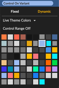
If you prefer to choose the dynamic color by name, click on the name above the grid to see a menu of all colors in the set by name.
About Live Colors
There are about 70 entries in the set of Live Theme Colors. The menu can be a bit overwhelming, so it can help to learn the most commonly used colors in objects. live.dial makes use of 11 colors of which the following are significant:
- Control Range On -- the range of the control when active
- Control Range Off -- the range of the control when inactive
- Control On or Control On Variant -- the control's value when active
- Control Off -- the control's value when inactive
- Border Color (Focus) -- the border around the control when it has keyboard focus
- Control Needle On -- the control needle when active
- Control Needle Off -- the control need when inactive
- Text Color -- the text color
Many of the other theme colors in the menu are used in the Live UI for indicating selection or a special modes, so they could potentially be confusing if used for controls in a UI.
Exploring Other Color Sets and Themes
To choose another set of dynamic colors, click Live Theme Colors and choose a set from the menu.

Most of the time you'll want to use either Live Theme Colors or Max Theme Colors; these two items appear at the top of the menu. The other sets represent different colors used in the Max interface. For example, Max Console is the collection of colors used to display text and backgrounds in the Max Console.
Using Gradients
A small number of Max user interface object background colors can be specified as gradients. The background of a message box is one example. The Gradient editor in the color panel is only available if the color you're editing can be a gradient.
To use the gradient editor:
- Make a new message box
- Show the inspector for the message box
- Click on the color swatch for
Background Colorto edit it. The color palette is in gradient mode.

The gradient editor has three components. First, you can change either of the two colors that make up the gradient using the active edit color selection:

Second, you can edit the gradient parameters by clicking on the pencil icon.

The gradient editor will appear.
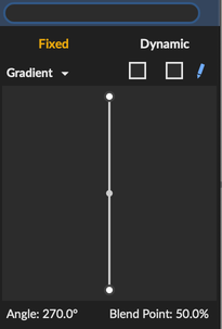
The following animation demonstrates the basic operation of the gradient editor, setting the gradient angle, the blend point, and the size of the blend region.
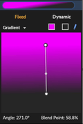
With gradient compatible background color attributes, you're not obligated to use a gradient.
To switch to a solid color, click on Gradient and choose Color Fill from the menu.

Using the Color Picker
A final option for editing fixed colors is the standard Color Picker accessed by clicking the circular color icon near the top of the color palette.

Copying and Pasting Colors
To moving color values from the color palette to other applications, click # above the color grid.

You can Copy the current color to the clipboard in either hex (Copy Hex Value) or float (Copy Float Value).
To import a color value into the color palette from another application, choose Paste. The color palette accepts values as four floating-point numbers or a hex string, which can optionally be preceded by a pound sign (AEFC06 or #AEFC06).