Color Themes
A Max Color Theme defines the colors of elements of the Max user interface, like the toolbar color, as well as default values for object color attributes. You can choose the color theme that you like best, or define your own custom color theme.
Note that a Max Style will take precedence over the current theme, if a custom style is set.
Choosing a Color Theme
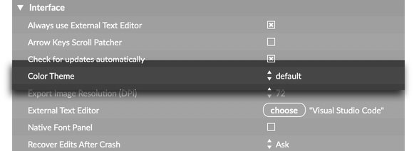
You can change the colors of the Max interface by choosing a new theme. In the application preferences (Max > Preferences...), under the Interface the Color Theme option lets you select your preferred theme.

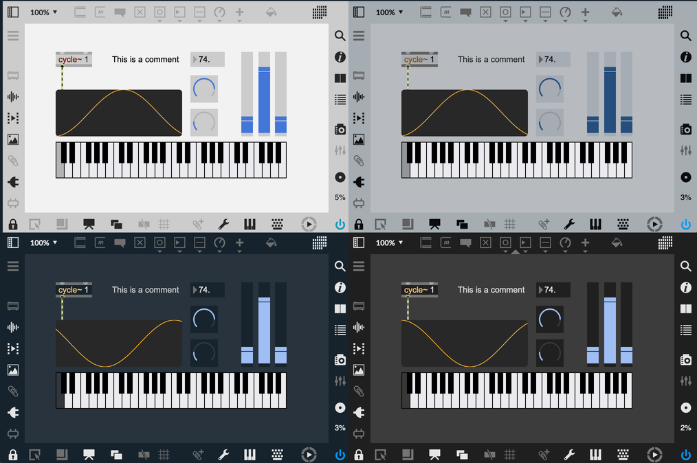
Max ships with several color themes, including light and dark themes, as well as themes from previous versions of Max.

Custom Color Themes
If you want to create a custom Max theme, it must be part of a Max Package. Create a custom theme by creating a .maxtheme file, then placing that file in the interfaces/themes directory inside your package folder. Max will automatically make your custom theme available alongside the built-in themes in the application preferences.
The easiest way to make a custom color theme is to start from one of the existing themes. On macOS these can be found in the application bundle—right-click on the Max application, select "Show Package Contents" and navigate to Contents > Resources > C74 > interfaces > themes. On Windows these can be found in Program Files > Cycling '74 > Max 8 > Resources > interfaces > themes.
Designing Robust Patcher Interfaces
If you want to share your patches with other people, you should take the time to make sure that your patches are theme-aware. There are simple guidelines that you can follow if you want your patch to look good, even when the user switches between themes. This is especially important if you're trying to share a Max for Live device, as that device will follow whatever theme Live uses.
In order to make a patcher properly themed for Ableton (or Max) and robust in regard to theme changes, one of the following options should be followed for each UI element in your device (or patch):
- Use the default colors for all of a given UI element's colors. This should always follow the theme according to default theming behavior. If you require always dark or always light colors, please use appropriate dynamic colors that match these needs (see option #2).
- Use appropriate dynamic colors for all colors in any given UI element. This is especially important for any foreground and background colors. This allows for robust theme following, with different rules than the standard theme following behavior.
- Use fixed custom colors for all colors in any given UI element. This is especially important for any foreground and background colors. In this case, the colors will not adapt based on themes, but they will always use the authored colors and look the same under all themes.
Themes and Max for Live
The Max preference Follow Live Theme determines whether Max will update its own theme when the Live application changes themes. By default this preference is On. An individual user who wishes to retain legacy theme behavior, can turn this setting Off. And for Max users that wish for the last used Live theme to persist when using Max without having been launched via the Max for Live edit button, may set this preference to Persist.
It is generally not recommended to change the Max theme while running as the Max for Live editor with Follow Live Theme set to On or Persist. This leads to a confusing fight between custom Max themes and the Live theme being followed. If you find yourself in this situation. It is recommended to quit and restart Max (or simply change the theme in Live), to restore expected behavior. In general for testing Max for Live devices with Light and Dark themes, it is recommended to have Follow Live Theme set to On and to change the theme inside Live.
Accessing Theme Colors from JavaScript
Inside a JavaScript object like v8, v8ui, or v8.codebox, you can access theme colors using the max.getcolor function. For example, max.getcolor(“live_lcd_bg”) will return the color associated with the LCD Background color. If you're using this color with a custom UI object, it's recommended to fetch this color in your paint() method. Since paint() is called automatically whenever the theme changes, this guaranetees that your paint() function will always be called with up-to-date colors from the current theme.
It's also possible to set the value of a color in the current theme using the max.setcolor function. You could use this function to update the current theme dynamically. Note that this function is only available in v8.
The JavaScript API max.getcolor and max.setcolor functions use theme color ids, while the themecolor object can use either ids or theme color display names.
Color Theme Format
A Max color theme is a set of Dynamic Colors combined with default values for the current Style. Together, these two sets of values define colors for the Max application as well as Max objects.
The .maxtheme file is simply a JSON file with two properties, colors and styledefaults. The colors property defines the values of Dynamic Colors within that color theme. This is a dictionary that maps identifiers to specific color values. When the application needs to know what color to draw a UI element, it can look in this dictionary to see what color would be consistent with the current theme.
// Example of the "colors" section of a .maxtheme file
{
  "colors" : [
    {
      "id" : "alignmentguide", // The internal name of the color
      "oncolor" : [ 0.737255, 0.466667, 0.219608, 1.0 ], // RGBA format
      "category" : "Patching",
      "label" : "Alignment Guide" // The display name of the color
    },

    {
      "id" : "assistance_background",
      "oncolor" : [ 0.843137, 0.835294, 0.796078, 0.94 ],
      "category" : "Patching",
      "label" : "Assistance Background"
    }

    // ... more colors here
  ]
}
The styledefaults are similar, but work with the current Style to determine the final color of an object. These specify the default color of an object if no other color is defined.
// Exmaple of the "styledefaults" section of a .maxtheme file
{
  "styledefaults" : 	{
    "bgcolor" : [ 0.2, 0.2, 0.2, 1 ],
    "color" : [ 0.807843, 0.898039, 0.909804, 1 ],
    "elementcolor" : [ 0.34902, 0.34902, 0.34902, 1 ],
    "accentcolor" : [ 0.501961, 0.501961, 0.501961, 1 ],

    // ... more colors here
  }
}
If an object needs to decide what color to draw, it first looks to its defined attibutes. For example, if a button object needs to draw its background, it looks to its bgcolor attribute. If the user has not defined a custom value for this color, it then looks at the object's style for a value for that color. If the style doesn't contain a value for that attribute, the object checks the patcher's style next. If the patcher doesn't have a style, or if the style doesn't define a color for the given attribute name, then the object will fetch the value from the current global color theme—this is what is specified by styledefaults.